Stylesheet Management
Introduction
Stylesheet Management allows you to modify the appearance of your graph results based on the label of the element (vertex, edge). Each element label found on your graph database will automatically be assigned a default style from the default stylesheet that will differentiate it from other elements. This is also applicable when new elements are introduced to the graph, as the data model for your database is automatically updated. For reference, see Data Model Management.
To modify the stylesheet, click on in the graph sidebar. Alternatively, when focusing on an element, you will be given an option to edit the element's stylesheet. You can also find this option from the Connection List sidebar by drilling into the Data Model.
Changes to the stylesheet are automatically applied to any opened graph results visualization.
Stylesheet Options
When editing the Stylesheet, you will be presented with the following window:
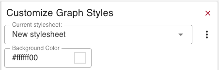
The following options are available for the stylesheet itself:
- Current Stylesheet: The stylesheet to be used / edited
- Background Color: The background color for the graph
- Set As Default Stylesheet: Make the active stylesheet the default (only shows when the current stylesheet is not the default)
Click on in the top right to access further options:
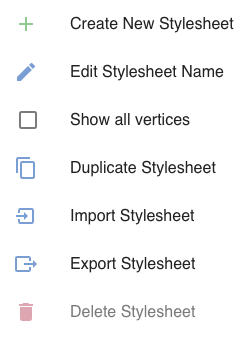
- Create New Stylesheet: Create a new stylesheet
- Edit Stylesheet Name: Edit the name of the stylesheet
- Show all vertices/edges: Shows all vertices/edges, rather than filtering out elements that are not currently showing on the graph
- Duplicate Stylesheet: Create a new stylesheet with the same settings
- Import Stylesheet: Import a saved stylesheet
- Export Stylesheet: Save the stylesheet as a JSON file
- Delete Stylesheet: Delete the stylesheet (the original Generated Stylesheet cannot be deleted)
Vertices and Edges Options
Underneath, you will be able to edit the settings for each individual label.
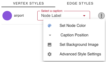
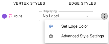
- Set Node/Edge Color: The color of the node circle / edge line
- Caption Position: Select the position for the caption to appear in relation to the node circle (Vertices Only)
- Set Background Image: The background image to be used for the node circle (Vertices Only)
- Advanced Style Settings: Brings up the advanced stylesheet menu
Captions
Here you can select what the caption of your elements will be derived from. By default, it is set to Node Label, but there are many more options.
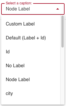
For each element, you can select any of the properties belonging to its label, along with some standard options. For edges, this is expanded to include the properties of that edge's in and out vertex label.
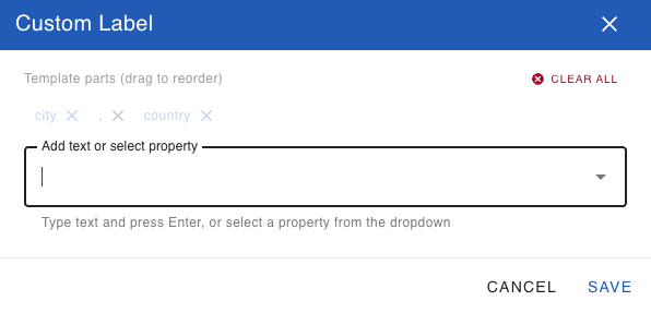
Custom Labels
You now have the ability to create custom string label templates for vertex and edge labels. These can be built from a combination of properties and plain text, so you can fully customize each label.
Advanced Vertex Stylesheet Options
When editing a Vertex's advanced settings, you will be presented with the following screen:
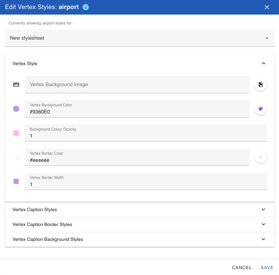
The following options are available:
- Vertex Style:
- Vertex Background Image: Allows specifying a background image for the node's body
- Vertex Background Color: The color of the node’s body
- Vertex Background Color Opacity: Allows specifying the opacity of the node's background color. It is recommended to set to 0 if Vertex Background Image is also specified unless you would like the background color and image to be used in conjunction.
- Vertex Border Color: The color of the node’s border
- Vertex Border Width: The size of the node’s border
- Vertex Caption Styles:
- Caption Value: The caption as derived from the node's properties to be displayed on the graph
- Caption Text Color: The color of the element’s caption
- Caption Vertical Alignment: The vertical alignment of a node’s caption; may be top, center, or bottom
- Caption Horizontal Alignment: The vertical alignment of a node’s caption; may be left, center, or right
- Caption Text Transformation: A transformation to apply to the label caption; may be none, uppercase, or lowercase
- Caption Font Size: The size of the caption text
- Vertex Caption Border Styles:
- Text Border Width: The width of the border around the caption
- Text Border Style: The style of the border around the caption; may be solid, dotted, dashed, or double
- Text Border Opacity: The width of the border around the caption; the border is disabled for 0
- Caption Text Border Color: The color of the border around the caption
- Vertex Caption Background Styles:
- Caption Background Color: A color to apply on the caption background
- Text Background Opacity: The opacity of the caption background; the background is disabled for 0
Advanced Edge Stylesheet Options
When editing an Edge's advanced settings, you will be presented with the following screen:
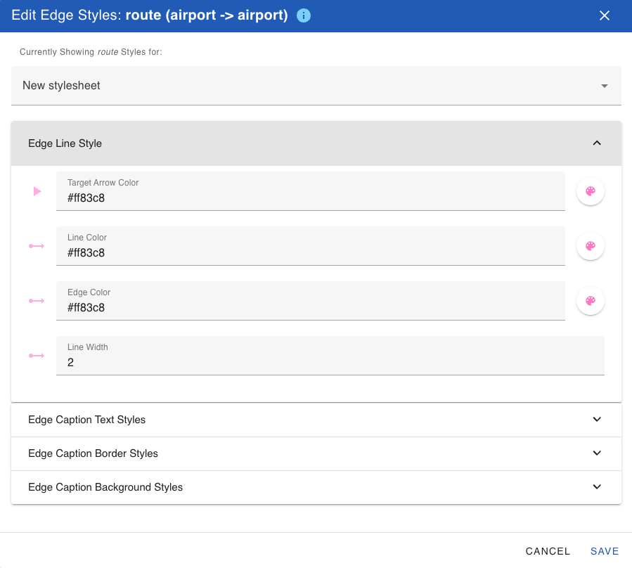
The following options are available:
- Edge Line Style:
- Target Arrow Color: The color of the edge’s target arrow
- Line Color: The color of the edge’s line
- Edge Color: The color of the edge
- Line Width: The width of an edge’s line
- Edge Caption Text Styles:
- Caption Text Value: The text as derived from the edge's properties to be displayed on the graph
- Caption Text Color: The color of the element’s caption
- Caption Vertical Alignment: The vertical alignment of an edge's caption; may be above edge, across edge, or below edge
- Caption Text Transformation: A transformation to apply to the caption text; may be none, uppercase, or lowercase
- Caption Font Size: The size of the caption text
- Edge Caption Border Styles:
- Text Border Width: The width of the border around the caption
- Text Border Style: The style of the border around the caption; may be solid, dotted, dashed, or double
- Text Border Opacity: The width of the border around the caption; the border is disabled for 0 (default value)
- Caption Text Border Color: The color of the border around the caption
- Edge Caption Background Styles:
- Caption Background Color: A color to apply on the text background
- Text Background Opacity: The opacity of the caption background; the background is disabled for 0