
The Weekly Edge: Baroque Org Charts, AI & Graph Visualization, Graph DB Demos & More [28 November 2025]
![The Weekly Edge: Baroque Org Charts, AI & Graph Visualization, Graph DB Demos & More [28 November 2025]](https://gdotv.com/wp-content/uploads/2025/11/weekly-edge-graph-visualization-28-november.png "The Weekly Edge: Baroque Org Charts, AI & Graph Visualization, Graph DB Demos & More [28 November 2025]")
We’re switching things up this week with some graph visualization work that’s been catching our attention lately.
I think it’s pretty likely that regular Weekly Edge editor Bryce is sleeping off a turkey-induced hangover right about now. As it’s Thanksgiving in the good ol’ US of A we figured it was acceptable to let Bryce have a few days off from keeping tabs on the graph technology landscape. The newsletter is edited by me, Christian Miles, this week.
Why am I not off for Thanksgiving I hear you ask? Well I’m up in Canada where we celebrated Thanksgiving months ago. I hear it’s something about the earlier harvest but I’ve never bothered to look that up. Here’s hoping I can match Bryce’s sunny disposition and Vitamin D energy that usually hits your inbox every Friday.
I have a self-confessed passion for graph visualization so I’ve put together a set of links that has a distinctly visual theme:
- Graphs in the news: What a complex org chart tells us about the role of visualization
- Documentation graphs: Is there a role for graph visualization in the world of documentation and technical writing?
- Conference season: Highlights from IEEE Vis 2025
- DB Viz: Some inspiring projects from our friends in the Graph Database space.
- Original Generative: A delightful visual explainer of the graphs behind some beautiful programmatic artwork
Networks in the News:
I hadn’t heard of the company “First Brands” until they filed for bankruptcy back in September.
Turns out they were a massive provider of car parts in North America – if your car is over 10 years old, there’s a good chance it has First Brands parts.
The bankruptcy spooked investors, raising uncomfortable questions about overleveraged companies and whether other corporations are hiding similar problems.
Things got messier this month with news of a lawsuit filed against the previous CEO alleging he “fraudulently secured billions of dollars of financing” for the company.
I’m not in the habit of perusing bankruptcy filings but an article in the Financial Times drew my attention to this one in particular. After 39 pages of dry legalese and lists of entities the bankruptcy filing has this gem of a diagram:
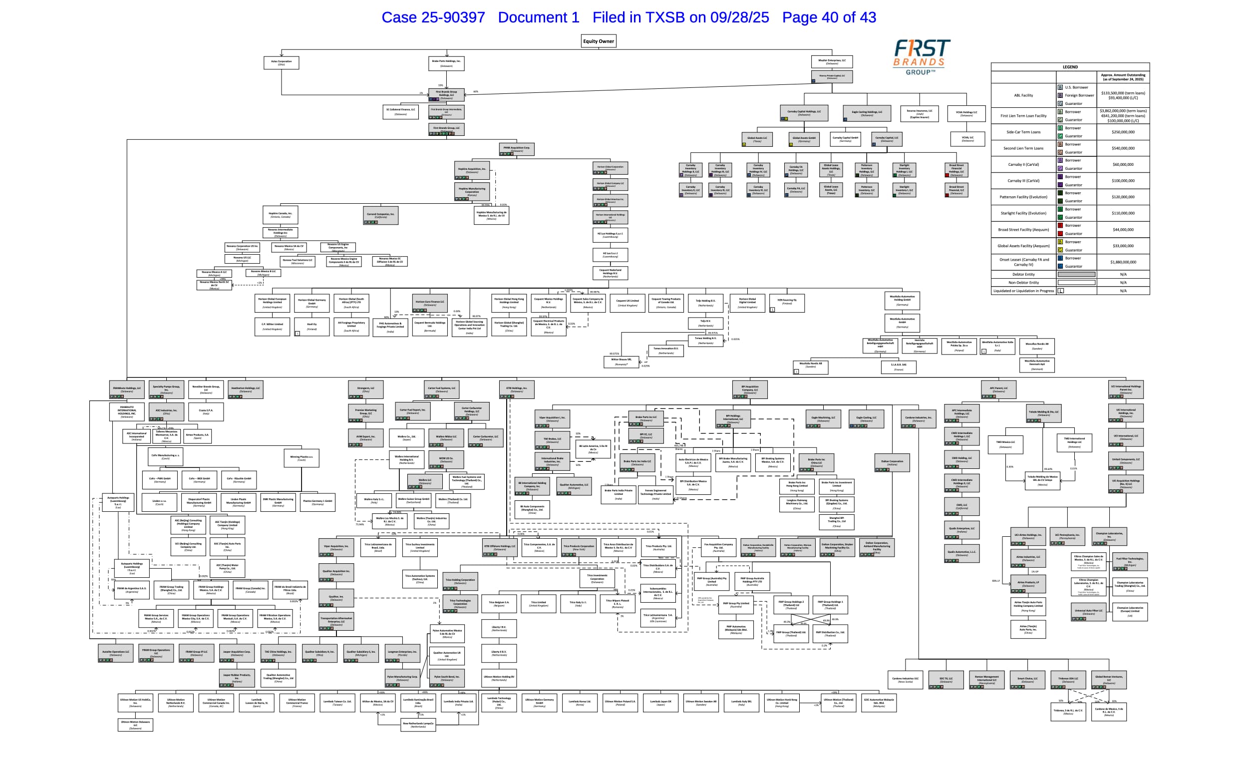
Described as a “baroque org chart” by the Financial Times, this is a fascinating look at the nested complexity of a modern corporation – I count over 110 different entities on the page with dense links showing the dependencies of each.
Unpicking this knot of debtors and entities requires visual tools – spreadsheets and PDFs can’t show you the architecture of a debt jungle.
It’s also a helpful reminder of the power of visualization for disseminating and explaining important information. Anyone interested can look at the above diagram and get a sense of how 100+ entities could hide $2.3 billion in phantom debt.
Graphs as Documentation
I’m seeing a new frontier for graph thinking: documentation and writing.
Whether you’re a markdown fan, DITA dude, or reStructuredText ranger, you know metadata matters for organizing content so users can actually find what they need.
And it turns out (like usual) that this problem is inherently graphy.
Modern documentation and writing platforms leverage “building blocks” in collaborative editors, authorship history tracking and dense cross-reference networks built up in personal knowledge bases.
Back in 2023 Principal Technical Writer Sarah Moir explored how graphs could augment or even replace hierarchical documentation structures.
A couple of newer projects caught my eye in the past few weeks.
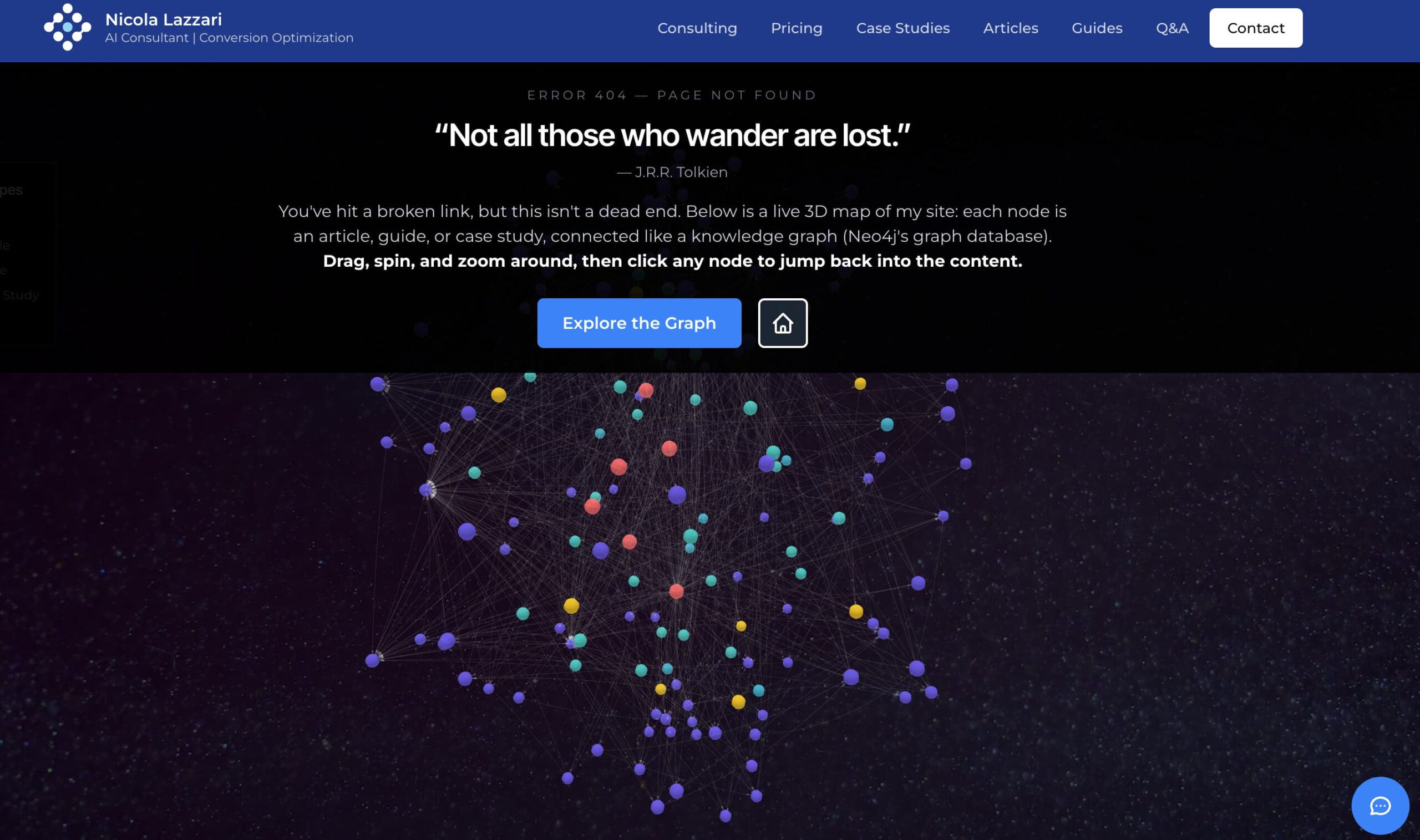
The first is an example of making something out of nothing: AI Consultant Nicola Lazzari built a new 404 landing page featuring a whizzy 3D graph visualization of the rest of his content, and shared the thinking behind it.
Technical writer Casey “CT” Smith built a little knowledge graph viewer for her personal blog and – even better – shared the code and details for anyone else to do the same.
And Harish Narayanan shared a helpful little python project that generates dependency graphs for GitHub pull requests – turning merge order into visual documentation.
Recent Research
November is apparently both the longest month of the year and the month for conferences. Connected Data London just wrapped up (more about this from us soon), ISWC was back on the 2nd of November (check out my colleague Amir’s coverage of the ISWC conference over on the G.V() blog), IEEE VIS 2025 was earlier this month and videos from Neo4j’s NODES developer conference have all been uploaded to their YouTube channel (watch this space for our top picks in the next few weeks).
For those unfamiliar, IEEE VIS is where academics (and some industry folks) geek out on visual data perception and techniques for communicating complexity. It was held in Vienna, Austria this year and while I couldn’t make it I’ve been pouring over some of the papers (and accompanying talks) that tell us about the bleeding edge of data visualization and give a hint of what might be picked up by innovative companies in the near future.
With my head in an AI cloud this month I was drawn to three papers that combined perception, multi-modal LLM models and good old fashioned network visualizations.
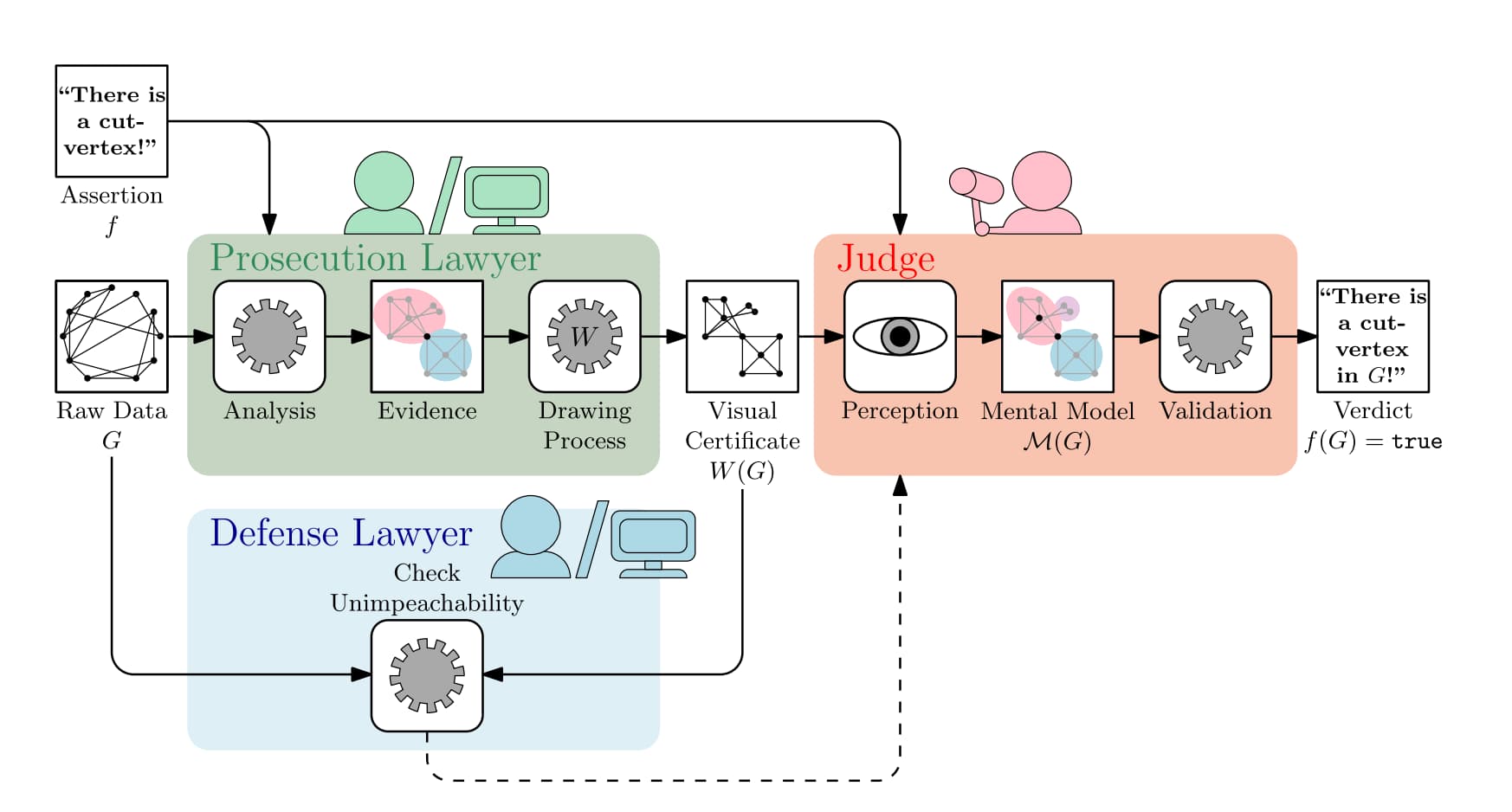
The first paper from Förster et al. looks at how graph visualization can help people verify claims made by AI systems. Given that AI models are largely black boxes, their approach offers a path toward transparency: they introduce “visual certificates” – visualizations designed to make specific graph properties obvious at a glance. If an AI claims a network has a particular structure or vulnerability, the visual certificate should let you see it’s true rather than just trusting the algorithm blindly.
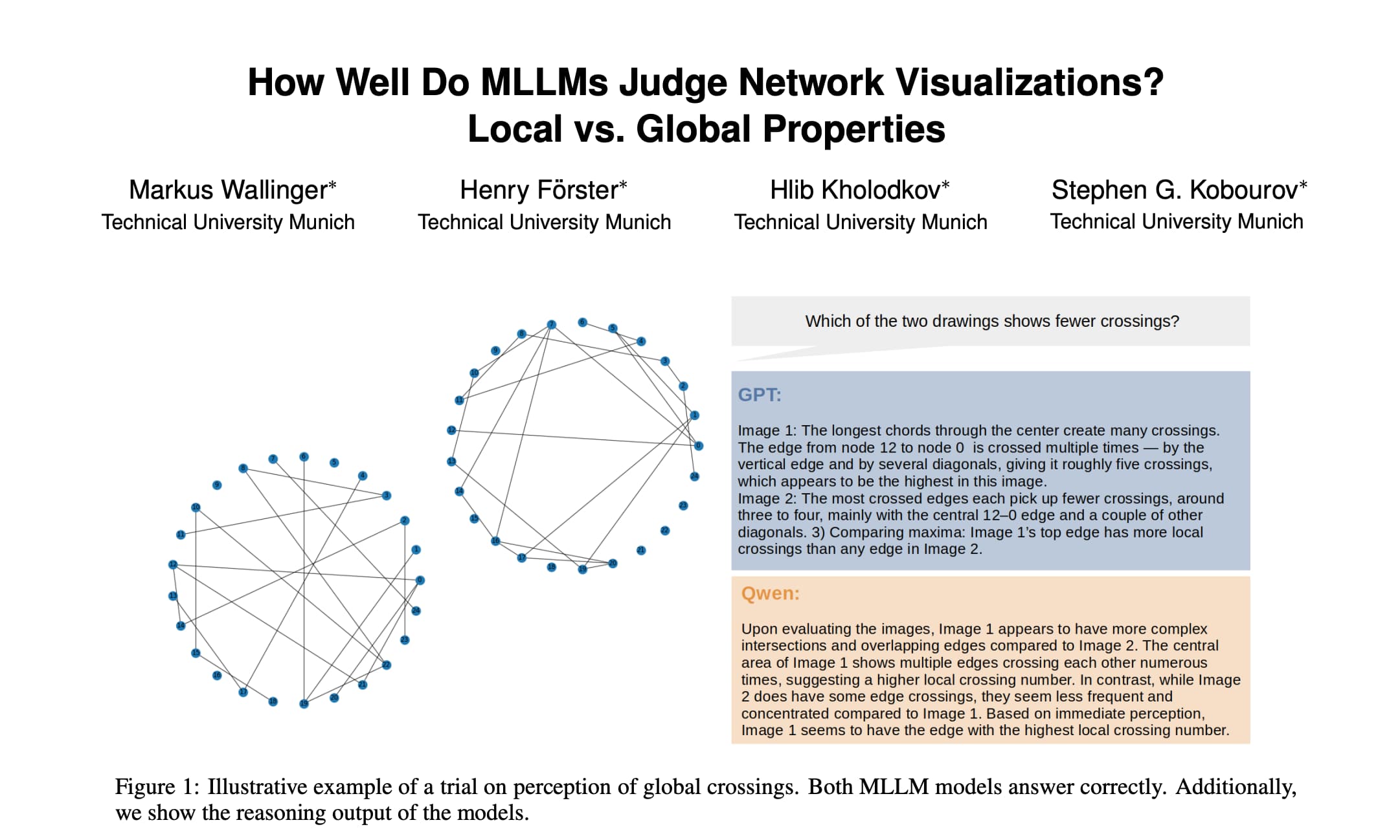
The second paper from Wallinger et al. attempts to answer the question “how well do LLMs comprehend network visualizations”? On its face it’s a bizarre sequence: we encode data into visual network diagrams for human consumption but, in turn, sometimes pass that representation to a multi-modal model for analysis. The paper reveals an interesting asymmetry: AI models are pretty good at graph properties across the board, but they’re consistently better at global properties (overall crossing count, average node spacing) than local ones (which single edge has the most crossings, which node has highest degree). The authors attribute this to the vision transformer architecture, which processes images in a way that naturally favors detecting overall patterns rather than identifying individual elements.
A third paper from Brand, Förster et al. complicates this picture considerably. The authors found that visualization style influenced graph feature perception more than actual graph structure. For example, force-directed layouts made models insist (with high confidence!) that bridges existed even when they didn’t. They therefore concluded that the models aren’t reasoning about the underlying structure of the graph and are distracted by the visual depiction.
One thing’s for sure: AI is giving us a whole new lens through which to explore the perception and analysis of graph visualizations.
Database Showcases
Back in the world of graph databases two of our industry friends produced some great educational content
FalkorDB’s recent webinar (over here on YouTube) covered their approach to converting natural language to queries using graph-powered schema understanding. Their key insight was to show that representing database schemas as graphs rather than lists helps LLMs reason about relationships and generate accurate joins. This was demonstrated hand-in-hand with a lineage graph visualization showing a “blast radius analysis” – which downstream models would break if you rebuilt a specific table, including materialization types (views, tables, incremental).
They reported improving accuracy from 15% with naive vector search to production-ready results on a 4,000-table database.
And did you know the final season of Netflix’s Stranger Things is released next week? Well in the graph world, Neo4j are no strangers to a good marketing tie-in (see what I did there?) but their latest project is extra ambitious.
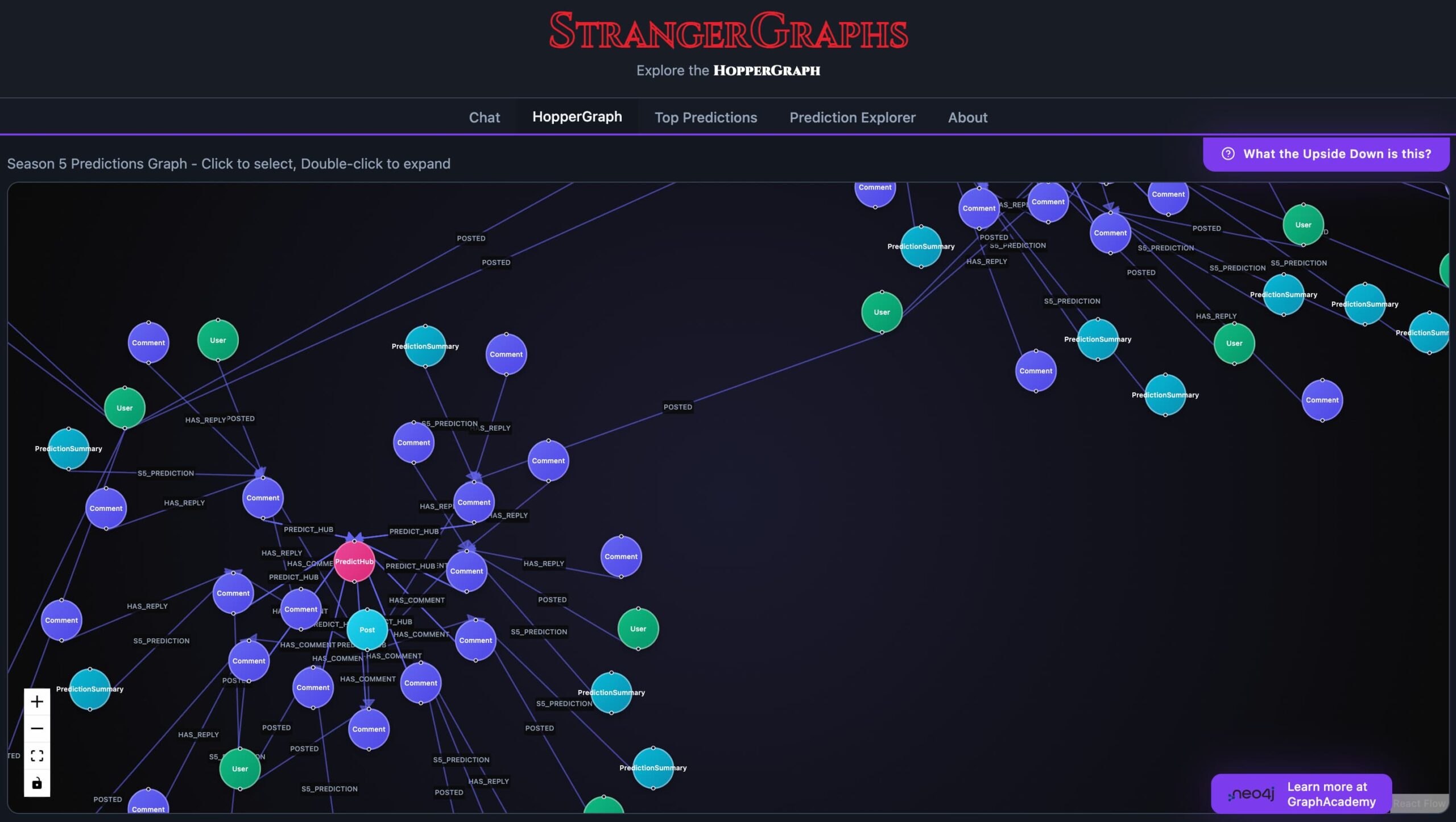
StrangerGraphs is a fan theory prediction engine that applies graph database analytics to the chaotic world of Stranger Things fan theories on Reddit. The company scraped 150,000 posts and ran community detection algorithms to identify which Stranger Things fan groups have the best track records for predictions. Theories were mapped as a graph (234k nodes and 1.5M relationships) that track characters, plot points and speculation and then used natural language processing to surface patterns across seasons. These predictions are then mapped out in a visualization for extra analysis. Top theories include ■■■ ■■■■■ ■■■■, ■■■ ■■■■■■■■ ■■ and ■■■■ ■■■■■■■■ ■■■ ■■ ■■■■. (Editor note: these theories have been redacted to avoid any angry emails about spoilers.)
Thanks
Whew. That’s a lot of typing! Not sure how Bryce does this every week. If you’ve made it this far down then hit reply or send us an email at weeklyedge@gdotv.com to let us know what you think. I’ll accept both positive feedback and exasperated cries to get Bryce back behind the keyboard.
P.S. We just formally welcomed the previous guest editor of Weekly Edge, Amir to G.V(). Learn more about his background over on the announcement post on LinkedIn.
, a GQL Playground, a Knowledge Graph of Your Vibe Code & More")
![Cypher DISTINCT: Removing Duplicates from Results [Byte-Sized Cypher Series]](https://gdotv.com/wp-content/uploads/2026/02/distinct-clause-byte-sized-cypher-query-langauge-video-series.jpg "Cypher DISTINCT: Removing Duplicates from Results [Byte-Sized Cypher Series]")
