Graph Algorithms on Billions of Edges with Apache DataFusion


How do you bring graph analytics to giant graphs?
You’d be forgiven for thinking running algorithms on huge datasets requires access to expensive, exclusive processing power. In many cases, offloading such calculations to supercomputers is by far the most convenient way to approach such problems.
But do you have to? If you implemented every optimization possible, just how much can your personal device do?
That’s what we’ll be investigating today. In a recent Weekly Edge we touched on a recent project by Sem Sinchenko. The project was investigating the use of Apache DataFusion, an open-source query engine for relational data, to compute graph algorithms on massive graphs. The project is summarized in detail in his recent blog post, “Algorithms on billion-scale graph using 10GB RAM: I love DataFusion!” and showcases a map-reduce pipeline that can meaningfully process billions of elements, using only a laptop.
Today, we’re going to review Sinchenko’s work, investigating whether the project is replicable and (if so!) validating his methodology. Along the way, we’ll discuss a little more of how these graph algorithms work and explain why a relational engine like Apache DataFusion can work so well on graph data. We’ll also run his pipeline on a couple of smaller datasets and check out the results with gdotv to help us understand the basis of this analysis.
The whole thing starts with Apache DataFusion itself, so let’s take a closer look.
What’s Apache DataFusion?
That’s just what I’ve been learning for myself the past couple of days. The best way I’ve found to put it is this: Apache DataFusion is a proof-of-concept demonstrating the power of transparency in query engines.
Built on “architecturally boring” software, Apache DataFusion claims that sometimes the best software requires nothing more than a straightforward implementation of established best practices. That’s why DataFusion is constructed from pre-existing and open-source software, and claims to compete directly with proprietary software on an industry scale. It’s built on Rust, a memory-safe programming language, and operates on Apache Arrow as its in-memory format.
This also leads us to one powerful feature of Apache DataFusion: its speed. Apache DataFusion achieves powerful query efficiency due to the columnar format used by Apache Arrow for in-memory processing, and Apache Parquet for storage. Columnar data offers a powerful advantage for large-scale analytics, as only necessary columns are read, not entire records (i.e. rows).
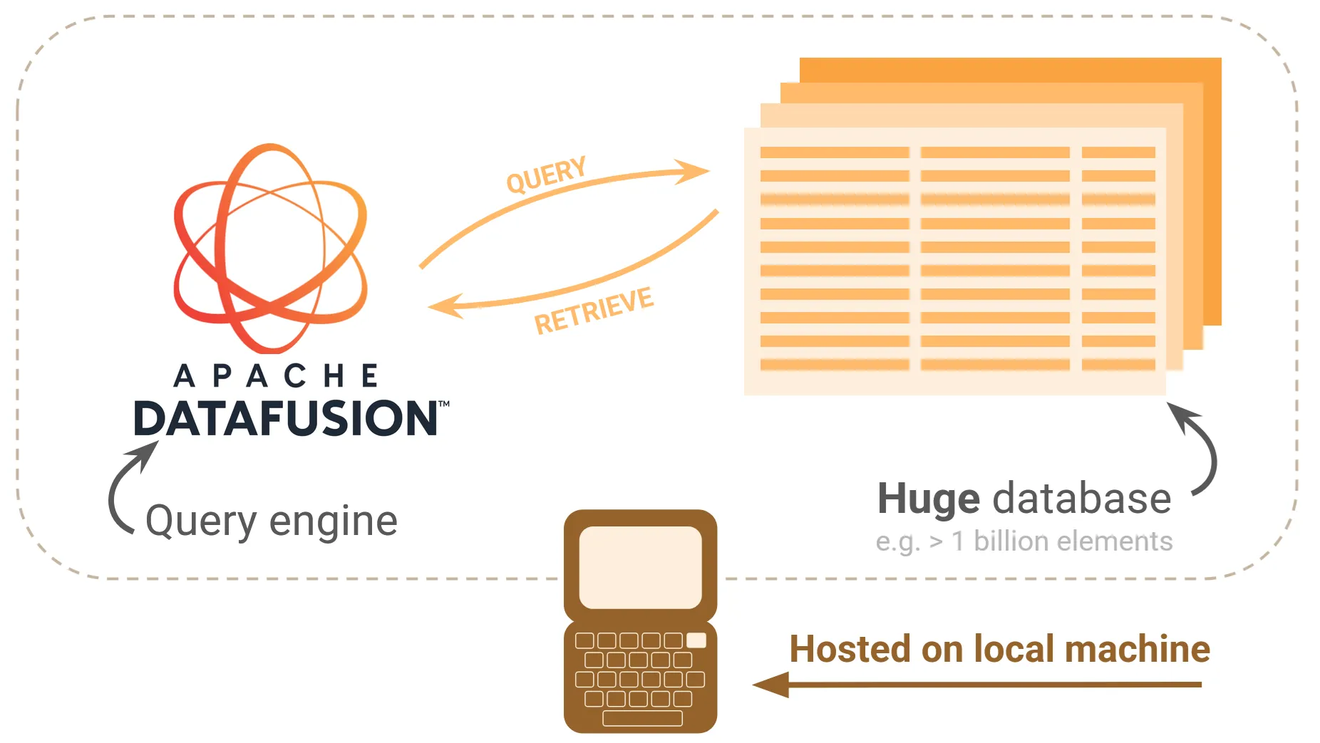
Above and beyond this, DataFusion claims a unique advantage in versatility. It claims its open architecture and customizable APIs allow users to couple high performance, transparency and flexibility in a way that can be embedded into your own projects and hosted locally. That’s exactly what Sinchenko has taken advantage of to build his pipeline. Apache DataFusion lets you construct powerful projects from the ground up without a remote server.
To learn more about the motivation, nature and architecture of Apache DataFusion, check out the SIGMOD 2024 Paper.
Project Overview
So how does the project actually work?
In this case, Apache DataFusion acts as not only a query engine, but also the metaphorical engine at the heart of Sinchenko’s analysis. Our graph is stored in a relational form (a collection of vertex and edge .parquet files) which means we can use Apache DataFusion to query it, even though it’s a graph.
As long as the individual steps of the algorithm can be constructed from ordinary SQL queries, then we can pass those commands along to Apache DataFusion to procedurally run the algorithm to completion. Along the way, we can save our progress in additional .parquet files.
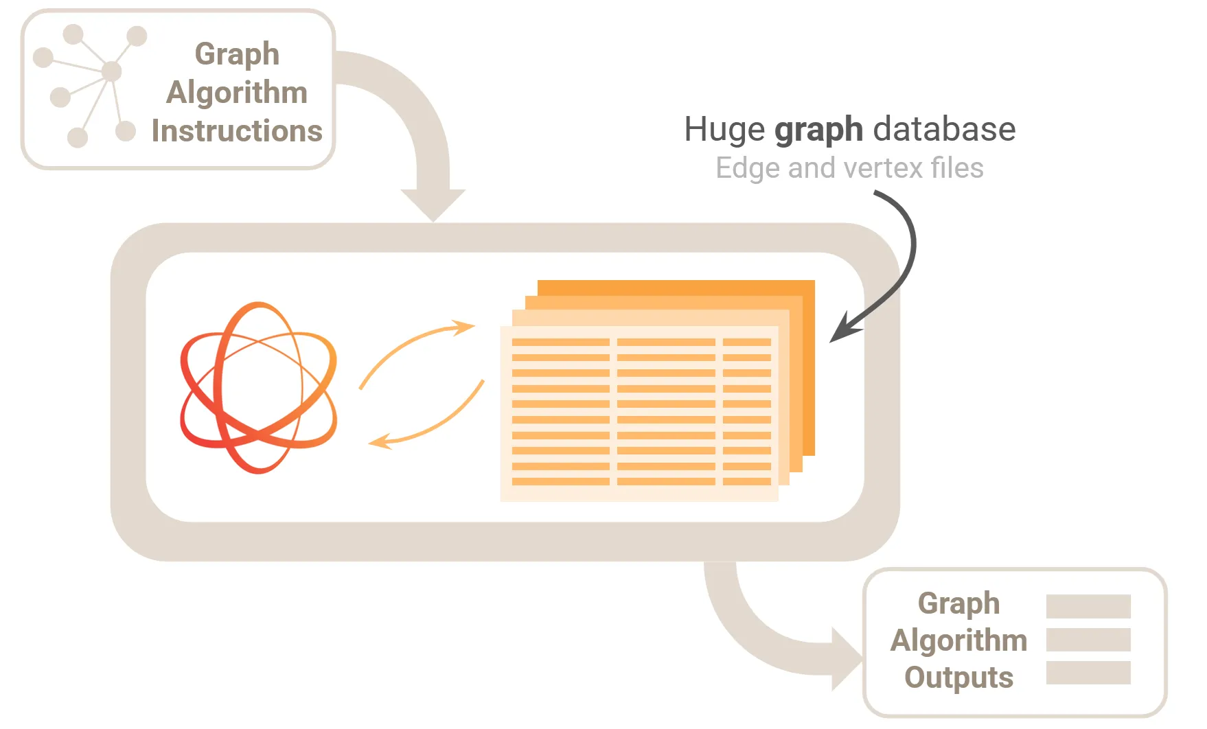
This is a kind of MapReduce analysis. This is a technique to split large computations across a distributed architecture.
For an algorithm to be implemented via a MapReduce process, the individual steps need to be the kind of operations that can be performed locally, i.e. on a subsection of the data, in such a way that the results can then be integrated across the entire graph.
For example, if your algorithm was designed to count the number of instances of the letter ‘e’ in a body of text, then you could split the text into sentences, count the letter ‘e’ in each sentence, then take the total at the end as the sum of all results. This is the kind of approach that works with a MapReduce.
In a graph context, you want a similar kind of partitioning. You want an algorithm that can, for example, be applied to a subset of the graph without reference to the rest of the graph. An example would be a node operation that only applies to the node’s closest neighbors. We will see that the wcc and pagerank algorithms that Sem implemented fit this bill.
A tutorial I found useful is this MapReduce YouTube video by Computerphile.
Now we’ll give a basic overview of the two algorithms used in this analysis: PageRank and Weakly Connected Components.
PageRank
This is the famous algorithm developed by Larry Page to index websites on Google, now used across many domains.
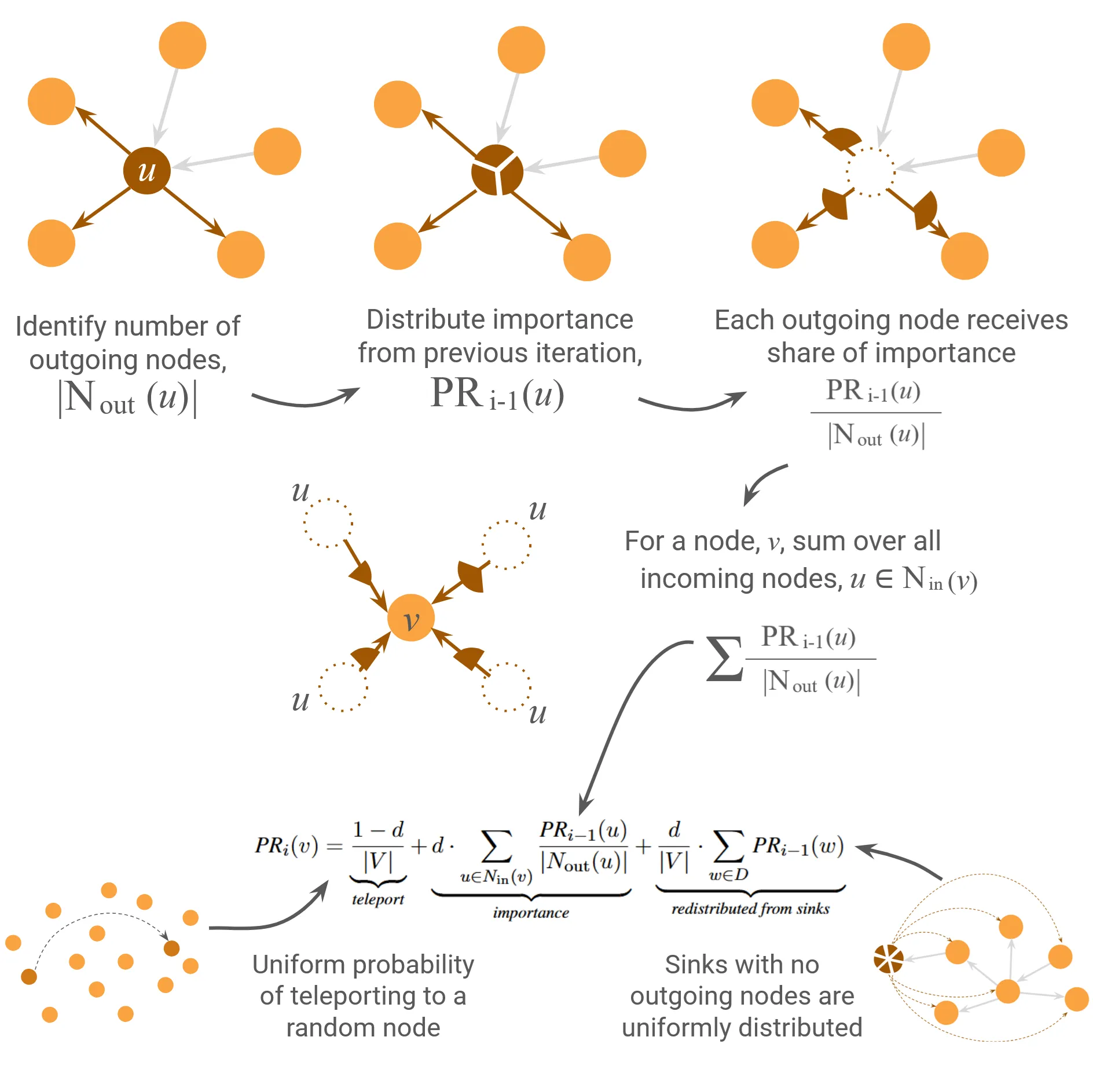
PageRank attempts to quantify the nebulous concept of ‘influence’ across a network. The idea is that influential vertices will have a high number of incoming edges (citations or links in a web context), particularly from other influential vertices. Since the influence of a vertex is related to the influence of its neighbors, the algorithm needs to iteratively converge to a sufficiently stable state, typically defined by a stability criterion.
Each vertex is initially assigned equal influence, summing to unity. With each iteration, the algorithm iteratively distributes the influence of each node over its neighbors. Additional terms avoid influence being disproportionately hoarded or drained by fringe nodes on the end of chains.
Using the definition given by Equation 2.3 of The LDBC Graphalytics Benchmark, I have illustrated the general principle of the algorithm diagrammatically below:
Sinchenko’s implementation is visible in pagerank.rs.
Weakly Connected Component Algorithm
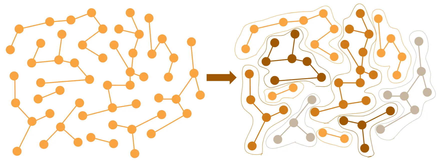
The Weakly Connected Component Algorithm or wcc is intended to split a graph into subgraphs (if they exist) of connected nodes.
In other words, it’s identifying any isolated islands in your graph, like this:
The general principle is straightforward, and pretty close to the intuitive way you would solve such a problem by hand.
You start with a node, keep track of the neighbors, and then check the neighbors of those nodes. Keep iterating until there are no more neighbors to find. You now have a list of all the nodes in a single connected cluster. If you make sure to run the algorithm across all the nodes in your graph, then you will have a list of all the clusters in your dataset.
Note that the graph is symmetrized at the very beginning, so that incoming and outgoing nodes are treated equivalently. This is the meaning of weakly connected components, i.e. entities that are connected if you ignore edge direction. Strongly connected components could be found using the same algorithm, but with edge direction included.
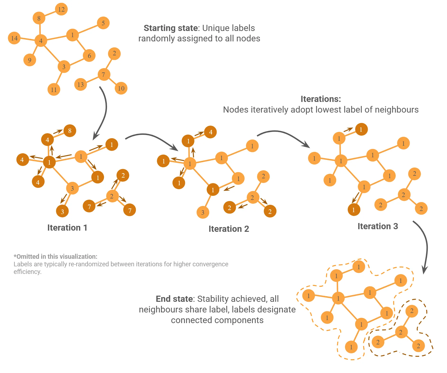
A typical implementation involves using label propagation, i.e. changing node labels to match the labels of their neighbors. Iterating causes labels to spread across edges until connected components all share a label.
Here is a basic diagram I composed to give the idea:
Beyond this, the primary technical challenge to the WCC algorithm is how to perform the scan effectively, using e.g. SQL operations. On very large graphs, a naive implementation can quickly overwhelm your local memory.
Sinchenko discusses this algorithm himself from a computational standpoint in a previous blog post. He states that this implementation is based on work by Bögeholz et al. in In-database connected component analysis (2019).
His implementation is visible in connected_components.rs.
Running the Project
Sinchenko’s project can be found on GitHub.
Much like Apache DataFusion itself, his project is also written in Rust. You can install Rust here. If you haven’t used Rust before, it’s not too difficult to get started. You can install and build the project with:
cargo install --git https://github.com/SemyonSinchenko/graphframes-rsAnd run with appropriate arguments. At time of writing the appropriate order of arguments is:
cargo run [vertices_file] [edge_file] [algorithm] [params] [output_directory] [maximum_memory] [number_of_partitions]Where [algorithm] can be either pagerank or wcc and [params] is either the convergence tolerance (for PageRank) or the random seed input (for WCC).
Be aware that this repository is still under development, so this may change.
Simple Examples (Explanation and Verification)
Sinchenko’s original analysis operated on very large datasets, and can take some time to run.
Here I’ve come up with a couple of simple examples, which are available on the gdotv GitHub. Feel free to skip ahead to Large Example (Original Demo) if you’d just like to see verification that Sinchenko’s analysis was replicated.
Simple Example (Verification)
Sinchenko’s original analysis operates on large data files. You can skip ahead to the next section if you’d like to see that. However, those datasets are large enough that they take some time to complete (multiple hours for myself) and the results are also so large that it is difficult to clearly visualize at a glance what the algorithm is doing.
For this reason I have added a couple of smaller datasets in compatible .parquet format to the gdotv GitHub. Both datasets are extremely basic, just a few websites with a list of edges corresponding to links. In both cases, I have also included a .graphml file with the same nodes and edges so that you can directly view the graph without the hassle of converting the .parquet files.
For visualization, I hosted the graph on my laptop using Gremlin Server and connected it to gdotv. Connecting to gdotv is pretty simple, and only takes a few seconds. To follow along, you can download a free trial of gdotv here, and learn more about connecting to Gremlin server here.
Alright, let’s take a look at our data.
The dataset in grameframes-simple-dataset/wcc is designed to show clear clustering between three unconnected subgraphs across 19 nodes. Because the dataset is so small, there’s no real need to run an algorithm. If we load the wcc_graph.graphml file into Gremlin Server, then the subgraphs are immediately visible to the naked eye immediately within gdotv:
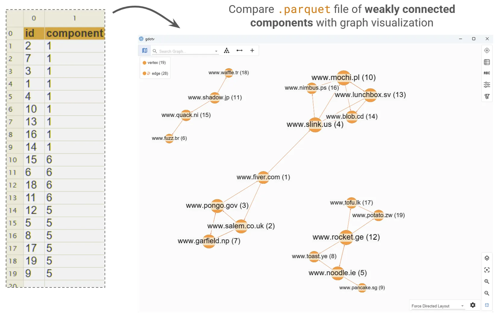
To make it a little easier to see which node is which, I’ve used gdotv’s custom label format to display a custom string on the node, which shows both the name of the website and the node id: {URL} ({node_id})
You can compare this to the output_0.parquet and output_1.parquet files to check that the algorithm output behaves as we expect. In the algorithm output, each component has been assigned a component id (1, 5 or 6 in this case) and each node is listed with the id of the component it belongs to.
You can verify for yourself that the components calculated from the algorithm match the clusters that are visible.
The dataset in grameframes-simple-dataset/pr, by contrast, is designed to visualize a simple PageRank algorithm across the same list of 19 websites. PageRank produces richer results when provided with a highly interconnected dataset, so I added a denser concentration of links to the edge file.
We can once again load pr_graph.graphml into Gremlin Server and compare the gdotv visualization to output.parquet.
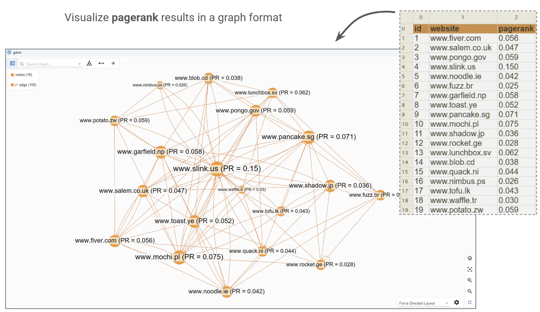
In this case, I added the pagerank outputs as properties of the nodes to make visualization easier. This allows me to display the nodes with the custom label {URL} (PR = {pagerank_output}).
I then sized the nodes with respect to their degree, i.e. that pages with a higher density of connecting links appear bigger. PageRank doesn’t directly correspond to degree (as we saw above, it’s a little more complicated than that), but it is closely related, so you can see visually that nodes with a higher degree tend to have a higher PageRank score.
While I haven’t conclusively proven that the wcc and pagerank algorithms are operating perfectly (that would take a careful and methodical inspection of the code), we have used gdotv as a sanity check that both algorithms are consistent with our expectations when applied to these small datasets.
Large Example (Original Demo)
In his demonstration, Sinchenko uses the graph500-26 and twitter_mpi datasets from the Graphalytics dataset. These datasets are relatively large (3.4GB and 5.7GB respectively) and the pipeline will require significantly more hard-drive space to run. That’s because the algorithms are inherently iterative, and therefore will require saving subsections of these graphs along the way as checkpoints and temporary files. When I spoke with Sinchenko, he recommended having at least 80GB free before running this analysis.
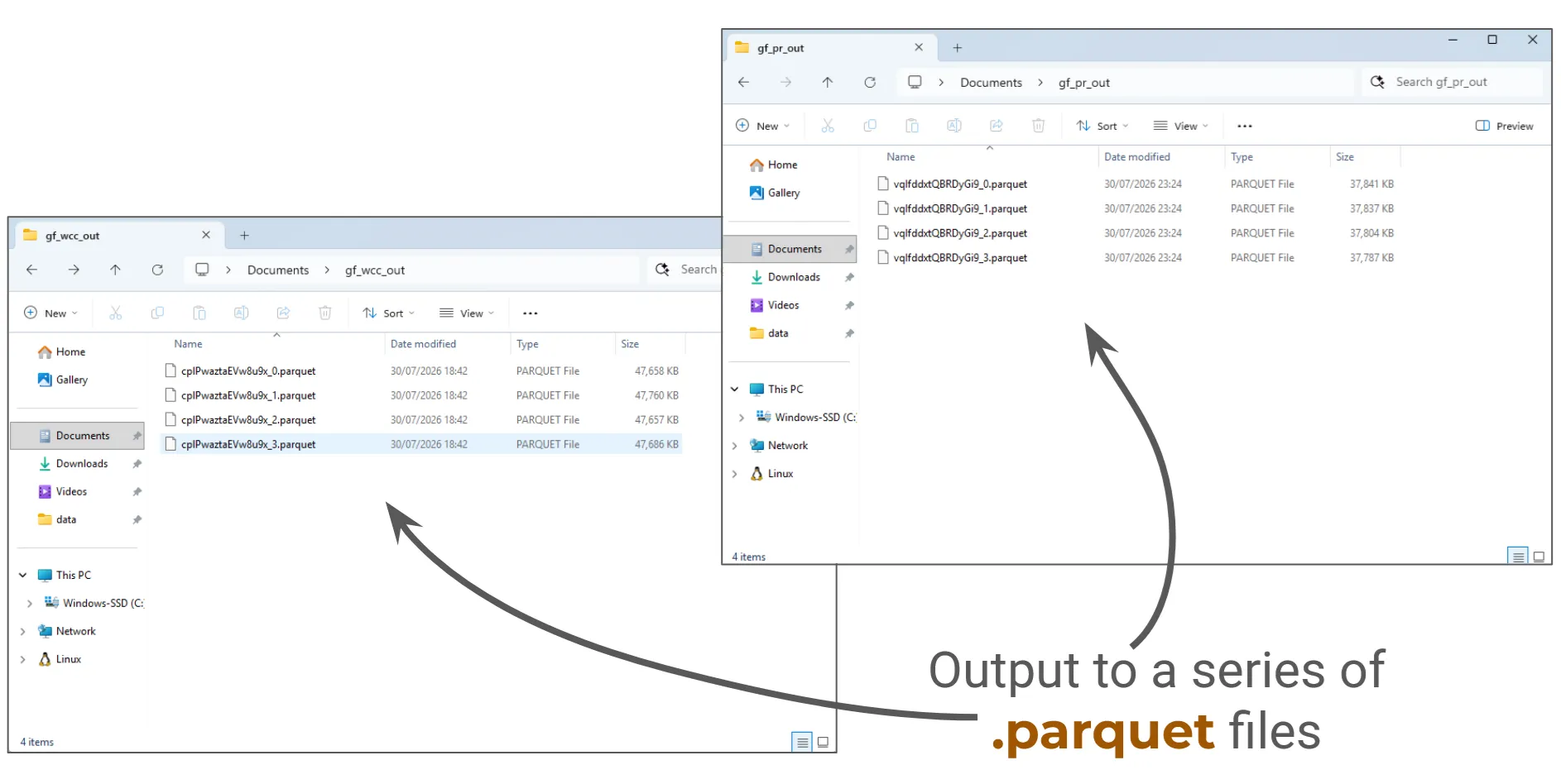
Make sure you know where your checkpoint gf_checkpoints/, temporary gf_df_tmp/ and output (gf_pr_out/ + gf_wcc_out/) directories are, and that they are fully accessible to you. These will be used to store large files during and after the analysis. The checkpoint and temporary files will be automatically deleted during ordinary operation, but you may have to manually manage them in case of a failed run.
Be particularly careful around memory management if using a virtual machine. For example, when using Windows Subsystem for Linux, the /ext4.vhdx virtual hard drive needs to be manually compacted to reclaim memory from deleted files. That means that the effective memory consumption from this pipeline could easily balloon to significantly more than 80GB, which will not be automatically reclaimed even after a successful run.
Here are the commands I used.
For pagerank I ran:
cargo run --release -- graph500-26-v.parquet graph500-26-e.parquet pagerank 0.01 "file:///C:/Users/amlen/Documents/gf_pr_out/" 8G 8My run of this algorithm used a completion criterion of 0.01 completed in 14 iterations.
For wcc I ran
cargo run -- twitter_mpi-v.parquet twitter_mpi-e.parquet wcc 42 "file:///C:/Users/amlen/Documents/gf_wcc_out/" 8G 2My run of this algorithm used random seen 42 and completed in 22 iterations.
I successfully got output for both algorithms that pass visual inspection and were only a few MB each. Seems like the pipeline works!
How does it work?
This project seems very promising, and indicates the strong potential a query engine like Apache DataFusion has to compute graph algorithms on massive datasets, using mundane hardware, and on human time scales.
While I haven’t done a full check of every element, I am satisfied that this pipeline is a clear proof-of-concept application demonstrating Apache DataFusion has made huge-scale graph algorithms much more accessible. If you run this pipeline yourself, or build anything similar, please do get in touch!
And huge thanks to Sem Sinchenko for putting this demo together!
About the author

Dr. Amber Lennox
Developer Relations Engineer
Amber manages developer relations at gdotv and (when not deep-diving into documentation) can be found wild swimming in questionable weather and working on personal programming projects like developing software for language learning. With a PhD in Astrophysics, Amber is particularly drawn to the mathematical and scientific aspects of graph theory and analytics.