How Dashboards Turn Questions into Data Analysis for Business Decisions

Dashboards are useful when working through large amounts of data, but they’re not just a collection of metrics for their own sake.
They’re a way to visualize data and make sense of it by answering specific questions. A network NOC dashboard answers very different questions than a product team’s Mixpanel dashboard, which in turn differs from a financial dashboard. There isn’t a single “right” dashboard, metric, or visualization – they’re tools used to answer questions in meaningful ways.
Well-designed dashboards surface assumptions, expose trade-offs, and constrain conclusions while decisions are still being formed. With the arrival of dashboards in the March release of gdotv, it’s time to discuss why they’re important but also to dissect what makes a dashboard an effective data analysis tool.
This post uses the Northwind dataset in Neo4j to demonstrate how dashboards can be used to reason through a business question step by step. Rather than starting with a predefined answer or a complex model, the goal is to show how a small number of carefully chosen visuals can narrow uncertainty, challenge intuition, and guide decision-making as the analysis unfolds.
We begin with a simple question: “When does adding a discount increase total revenue and when does it not?”
How to Follow along with This Dashboard Walkthrough
If you’d like to follow along with the examples in this blog post, I’d suggest using this Neo4j Northwind Docker repo. This repo provides a simple, repeatable way to spin up Neo4j in Docker and load the Northwind dataset automatically.
Here’s how to get started:
git clone https://github.com/storbeck/neo4j-northwind
cd neo4j-northwind

cp .env.example .env
# edit .env and set NEO4J_PASSWORD=yourpassword
docker compose up -d
Connection details:
- URL: http://localhost:7474
- Username:
neo4j - Password: whatever you put in
.env
To validate the connection to your graph database is working, you can run this sample Cypher query:
MATCH (o:Order)-[od:ORDERS]->(p:Product)
RETURN o,od,p
LIMIT 10
You can find the Cypher queries in this repo that were used to generate the dashboard panels shown below. Feel free to use these as a basis for creating your own dashboard-style charts and data visualizations.
Okay, let’s dive in.
The Problem: Data around Discounts Can Be Confusing
Our original question: “When does adding a discount increase total revenue and when does it not?”
Across the business world, discounting is frequently treated as a blunt instrument. A percentage is applied across a group of products, a category, or even the entire catalog, with the expectation that lower prices will naturally lead to higher revenue.
However, a discount can increase the number of units sold while still reducing total revenue if the additional volume fails to offset the loss in margin. In other cases, the same discount may meaningfully improve performance for one product while actively harming another.
Our challenge, then, is to determine not whether discounts increase activity, but whether they increase net revenue once margin loss is taken into account. Let’s see how dashboards can help us make that determination.
Data Analysis Structure
To answer the question of how discounts affect revenue and volume, we’ll need to break down the data accordingly.
Does Discounting Increase Revenue Overall?
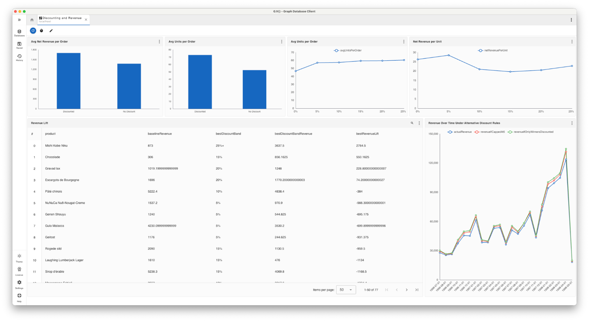
First, we’ll examine if discounting increases revenue overall. In the chart below, we see revenue and volume with no discount versus revenue and volume under varying discount levels.
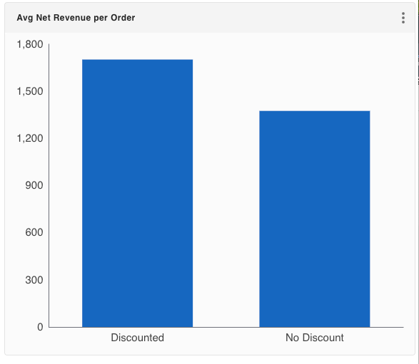
At a high level, discounted orders do seem to produce more revenue. Orders that include at least one discounted item contain more units on average, as we can see in the chart (further) below. Customers do respond to lower prices by buying more.
Try creating this chart yourself in gdotv with the following Cypher query.
Average Net Revenue per Order (Bar Chart):
MATCH (o:Order)-[od:ORDERS]->(:Product)
WITH
  o.orderID AS orderID,
  sum(toFloat(od.unitPrice) * toInteger(od.quantity) * (1 - toFloat(coalesce(od.discount,'0')))) AS netRevenue,
  max(CASE WHEN toFloat(coalesce(od.discount,'0')) > 0 THEN 1 ELSE 0 END) AS hasDiscount
RETURN
  CASE WHEN hasDiscount = 1 THEN 'Discounted' ELSE 'No Discount' END AS orderType,
  avg(netRevenue) AS avgNetRevenuePerOrder
ORDER BY orderType;
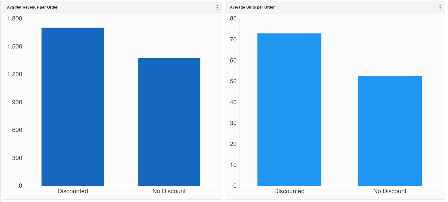
Discounted orders are larger and often generate higher net revenue per order because they contain more items. However, when revenue is evaluated on a per-unit basis or compared against a no-discount baseline at the product level, most discounts fail to justify their margin cost.
If you’re following along with the walkthrough, here’s the Cypher query to create the bar chart on the right above.
Average Units per Order (Bar Chart):
MATCH (o:Order)-[od:ORDERS]->(:Product)
WITH
  o.orderID AS orderID,
  sum(toInteger(od.quantity)) AS totalUnits,
  max(CASE WHEN toFloat(coalesce(od.discount,'0')) > 0 THEN 1 ELSE 0 END) AS hasDiscount
RETURN
  CASE WHEN hasDiscount = 1 THEN 'Discounted' ELSE 'No Discount' END AS orderType,
  avg(totalUnits) AS avgUnitsPerOrder
ORDER BY orderType;
How Discount Level Changes the Outcome
The next step is to examine how different discount levels behave.
Small discounts – particularly around 5% – tend to produce the most favorable balance between increased volume and retained revenue. As we can see in the chart below, when discounts deepen beyond that point, the revenue gains diminish quickly.
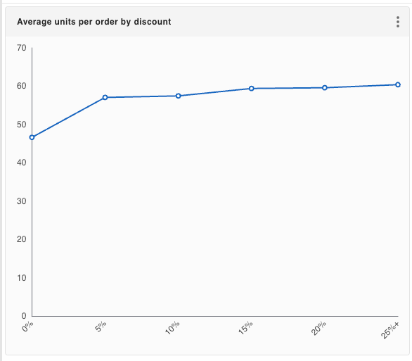
Higher discount levels do continue to increase order quantity, but the revenue retained per order drops sharply. By the time discounts reach the upper ranges, the additional volume no longer comes close to offsetting the margin loss.
It’s easy to assume that more aggressive discounts will amplify the effect seen at lower levels. But the data shows the opposite: discounting exhibits diminishing returns, and deeper discounts are generally destructive to revenue.
Here’s the Cypher query to create the chart for yourself.
Average Units per Order (Line Chart):
MATCH (o:Order)-[od:ORDERS]->(:Product)
WITH
  o.orderID AS orderID,
  toFloat(coalesce(od.discount,'0')) AS d,
  sum(toInteger(od.quantity)) AS totalUnits
WITH
  CASE
    WHEN d = 0 THEN '0%'
    WHEN d <= 0.05 THEN '5%'
    WHEN d <= 0.10 THEN '10%'
    WHEN d <= 0.15 THEN '15%'
    WHEN d <= 0.20 THEN '20%'
    ELSE '25%+'
  END AS discountLevel,
  CASE
    WHEN d = 0 THEN 0
    WHEN d <= 0.05 THEN 5
    WHEN d <= 0.10 THEN 10
    WHEN d <= 0.15 THEN 15
    WHEN d <= 0.20 THEN 20
    ELSE 25
  END AS sortOrder,
  totalUnits
WITH discountLevel, sortOrder, avg(totalUnits) AS avgUnitsPerOrder
ORDER BY sortOrder
RETURN discountLevel, avgUnitsPerOrder;
Why “5% Works” Is Not the Whole Story
It would be tempting to stop here and conclude that 5% discounts are simply the right answer.
While a modest discount performs best on average, averages hide important variation. Not all products respond the same way. Some products show a clear improvement in net revenue under a discount, while others perform best at full price and lose revenue under any form of discounting. See the chart below for some examples.
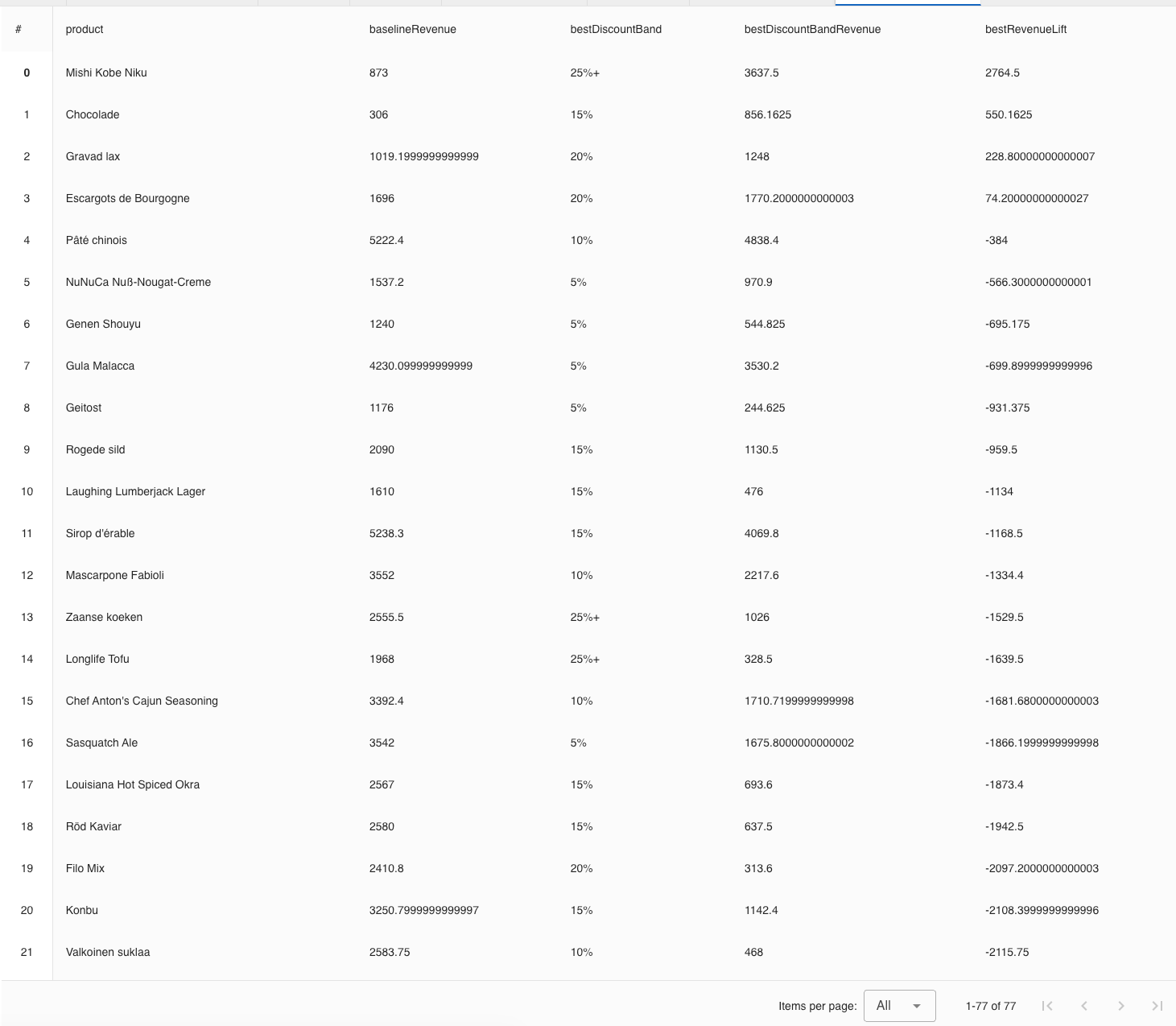
By comparing each product’s discounted performance against its own no-discount baseline, it becomes clear that only a subset of products actually benefit from discounting at all. For most products, maximum revenue is achieved at 0% discount.
Here’s the Cypher query so you can see for yourself.
Revenue Lift (Table):
MATCH (:Order)-[od:ORDERS]->(p:Product)
WITH
  p.productName AS product,
  toFloat(coalesce(od.discount,'0')) AS d,
  toFloat(od.unitPrice) AS unitPrice,
  toInteger(od.quantity) AS quantity
WITH
  product,
  CASE
    WHEN d = 0 THEN '0%'
    WHEN d <= 0.05 THEN '5%'
    WHEN d <= 0.10 THEN '10%'
    WHEN d <= 0.15 THEN '15%'
    WHEN d <= 0.20 THEN '20%'
    ELSE '25%+'
  END AS band,
  (unitPrice * quantity * (1 - d)) AS netRevenue
WITH product, band, sum(netRevenue) AS bandRevenue
WITH product, collect({band: band, revenue: bandRevenue}) AS rows
WITH
  product,
  head([r IN rows WHERE r.band = '0%']) AS baseline,
  [r IN rows WHERE r.band <> '0%'] AS discountedRows
UNWIND discountedRows AS r
WITH
  product,
  baseline.revenue AS baselineRevenue,
  r.band AS band,
  r.revenue AS revenue
ORDER BY product, revenue DESC
WITH
  product,
  baselineRevenue,
  collect({band: band, revenue: revenue}) AS ranked
RETURN
  product,
  baselineRevenue,
  ranked[0].band AS bestDiscountBand,
  ranked[0].revenue AS bestDiscountBandRevenue,
  (ranked[0].revenue - baselineRevenue) AS bestRevenueLift
ORDER BY bestRevenueLift DESC;
From Data Analysis to Dashboard
In this section, I’ll briefly explain how I chose the charts above and which alternatives were considered as I put together the larger dashboard in gdotv.
This dashboard above (and marked in groups below) was not designed to display everything the data could possibly show.
Instead, I designed it to answer a small number of specific business questions as clearly as possible. Each chart exists because it resolves a particular ambiguity or prevents a common misinterpretation, not because the data visualization itself is novel or visually dense. Let’s break it down, group by group.
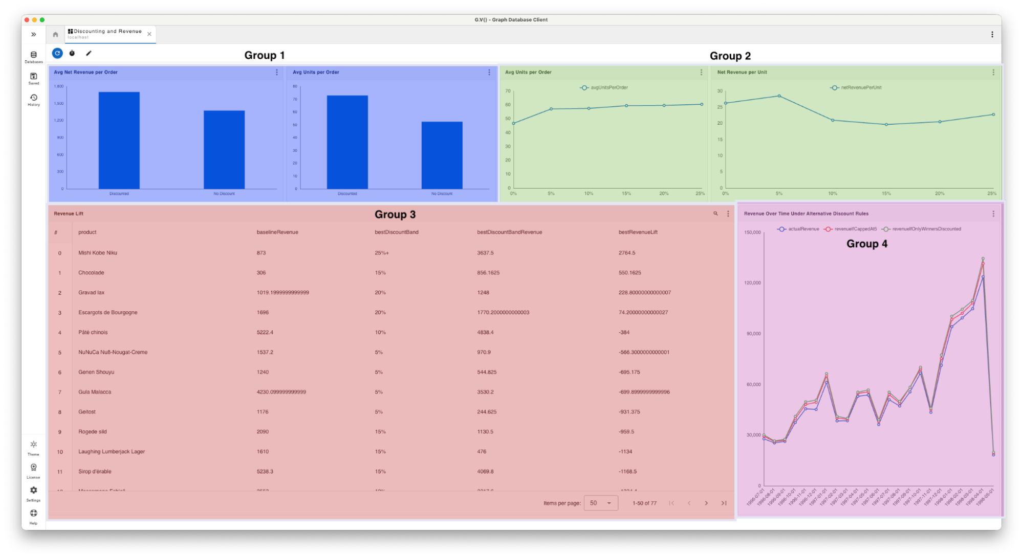
Group 1: Do Discounts Change Behavior?
The first group of charts in this dashboard establishes context. These charts answer the most basic questions an executive is likely to ask: What happens, in general, when we apply discounts?
By comparing discounted and non-discounted orders at an aggregate level, these views confirm that discounts do influence behavior. Orders with discounts tend to be larger, and at first glance, can even appear to generate more revenue per order. These charts are placed at the top left to ground the rest of the dashboard in basic knowledge which we will then break down further.
Group 2: Where Do Discounts Stop Paying Off?
The second group of charts (shaded in green above) introduces specifics. Rather than treating discounting as a binary choice, these charts show how outcomes change as discounts increase.
Here, I chose line charts to reveal patterns that bar charts would take longer to visually interpret. Order quantity rises steadily with higher discounts, while revenue efficiency peaks early and then declines. The dashboard viewer can see that the same mechanism driving larger orders also erodes value past a certain point.
This group of charts exists to correct the oversimplification in Group 1. It shows that “discounted vs non-discounted” is helpful but over-simplified, and that discount level matters.
Here’s the Cypher query to recreate the chart in the top right corner of the dashboard above.
Net Revenue per Unit (Line Chart):
MATCH (:Order)-[od:ORDERS]->(:Product)
WITH
  toFloat(coalesce(od.discount,'0')) AS d,
  toFloat(od.unitPrice) AS unitPrice,
  toInteger(od.quantity) AS quantity
WITH
  CASE
    WHEN d = 0 THEN '0%'
    WHEN d <= 0.05 THEN '5%'
    WHEN d <= 0.10 THEN '10%'
    WHEN d <= 0.15 THEN '15%'
    WHEN d <= 0.20 THEN '20%'
    ELSE '25%+'
  END AS discountLevel,
  CASE
    WHEN d = 0 THEN 0
    WHEN d <= 0.05 THEN 5
    WHEN d <= 0.10 THEN 10
    WHEN d <= 0.15 THEN 15
    WHEN d <= 0.20 THEN 20
    ELSE 25
  END AS sortOrder,
  (unitPrice * quantity * (1 - d)) AS netRevenue,
  quantity
WITH
  discountLevel,
  sortOrder,
  sum(netRevenue) / sum(quantity) AS netRevenuePerUnit
ORDER BY sortOrder
RETURN
  discountLevel,
  netRevenuePerUnit;
Group 3: Which Products Benefit from Discounting?
The third group in the dashboard (shaded in red) shifts from patterns to decisions. Once the general behavior is understood, the question naturally becomes: Which products should we discount?
This section replaces charts with a table because precision matters more than pattern recognition. Each product is evaluated against its own no-discount baseline, showing the discount level that produced the highest observed revenue for that product and the resulting lift.
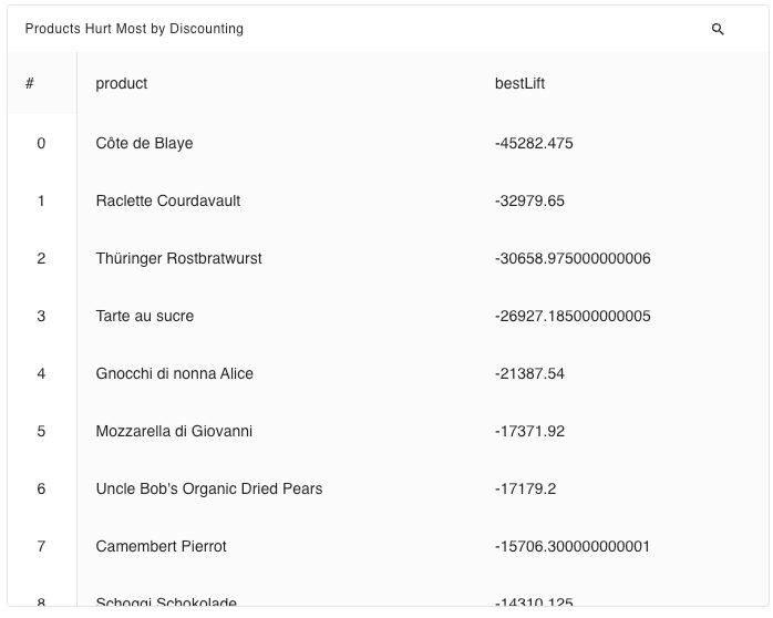
The key insight emerges when most of those revenue lifts are negative. Even at their best-performing discount, most products generate less revenue than they do at full price.
Group 4: What Happens If We Change the Discount Policy?
The final group (shaded in pink above) looks forward. Rather than asking what has happened, it explores what could happen under different discount rules.
By holding customer behavior constant and applying alternative discount policies, this view makes the long-term cost of discounting visible over time. It does not predict the future, but it illustrates the mechanical consequences of different strategies. This allows executives and decision-makers to reason about policy changes before committing to them.
If you’re following along, here’s the Cypher query to make it for yourself.
Predicted Revenue over Time with Discount Modifications (Line Chart):
MATCH (o:Order)-[od:ORDERS]->(p:Product)
WITH
  date(substring(o.orderDate, 0, 10)) AS d,
  p.productName AS product,
  toFloat(od.unitPrice) AS unitPrice,
  toInteger(od.quantity) AS quantity,
  toFloat(coalesce(od.discount,'0')) AS discount
WITH
  date.truncate('month', d) AS month,
  (unitPrice * quantity) AS gross,
  discount,
  product
WITH
  month,

  // 1) actual net revenue
  gross * (1 - discount) AS actualNet,

  // 2) cap any discount > 5% down to 5%
  gross * (1 - CASE WHEN discount > 0.05 THEN 0.05 ELSE discount END) AS capped5Net,

  // 3) cap everything at 0%, except winners (cap them at their best band)
  gross * (1 - CASE
    WHEN product = 'Mishi Kobe Niku' THEN CASE WHEN discount > 0.25 THEN 0.25 ELSE discount END
    WHEN product = 'Chocolade' THEN CASE WHEN discount > 0.15 THEN 0.15 ELSE discount END
    WHEN product = 'Gravad lax' THEN CASE WHEN discount > 0.20 THEN 0.20 ELSE discount END
    WHEN product = 'Escargots de Bourgogne' THEN CASE WHEN discount > 0.20 THEN 0.20 ELSE discount END
    ELSE 0
  END) AS winnersOnlyNet

RETURN
  month,
  sum(actualNet) AS actualRevenue,
  sum(capped5Net) AS revenueIfCappedAt5,
  sum(winnersOnlyNet) AS revenueIfOnlyWinnersDiscounted
ORDER BY month;
Why the Ordering of This Dashboard Matters
So why did I choose this particular order and grouping for our example dashboard?
In left-to-right reading cultures, users often begin scanning at the top-left of a page and move across and downward. Dashboards are no exception. Because layout strongly influences how information is perceived, I structured this dashboard to align with that common scanning pattern.

This structure reflects a broader principle: Dashboards are most effective when they guide the reader through a sequence of questions, not when they attempt to answer everything at once. The structure also highlights an important cross-cultural design consideration: if the native reading direction of the target audience is right-to-left, the same logic applies, but the layout should be mirrored to match how those users naturally scan information.
What This Data Analysis Means for a Discount Strategy
Three conclusions emerge from the data analysis in our example dashboard:
- Discounts do increase quantity, but quantity alone is a poor proxy for success. Larger orders can mask declining revenue efficiency, making discounting appear beneficial when it is not.
- Modest discounts around 5% tend to perform best on average, but this result is often misunderstood. In most cases, these discounts do not increase revenue; they simply minimize revenue loss compared to deeper discounts. A 5% discount is frequently the least damaging option, not a reliably profitable one. In other words, “best-performing” does not mean “value-creating.”
- Most importantly, discounting is a product-specific decision. The majority of products generate their highest revenue at full price and should not be discounted at all. A small subset of products does respond positively to discounting, sometimes requiring deeper discounts to unlock additional demand, but these cases must be identified and managed individually.
These conclusions didn’t merge from any single chart. They came from combining relevant metrics to narrow decisions, guided by the underlying question driving the dashboard.
Whether your dashboard is meant to show which business locations are performing best, which product features are gaining traction, or how revenue is trending over time – it should be built to serve you. Here at gdotv we’ve provided a variety of panels to help you explore and answer those questions against your database.
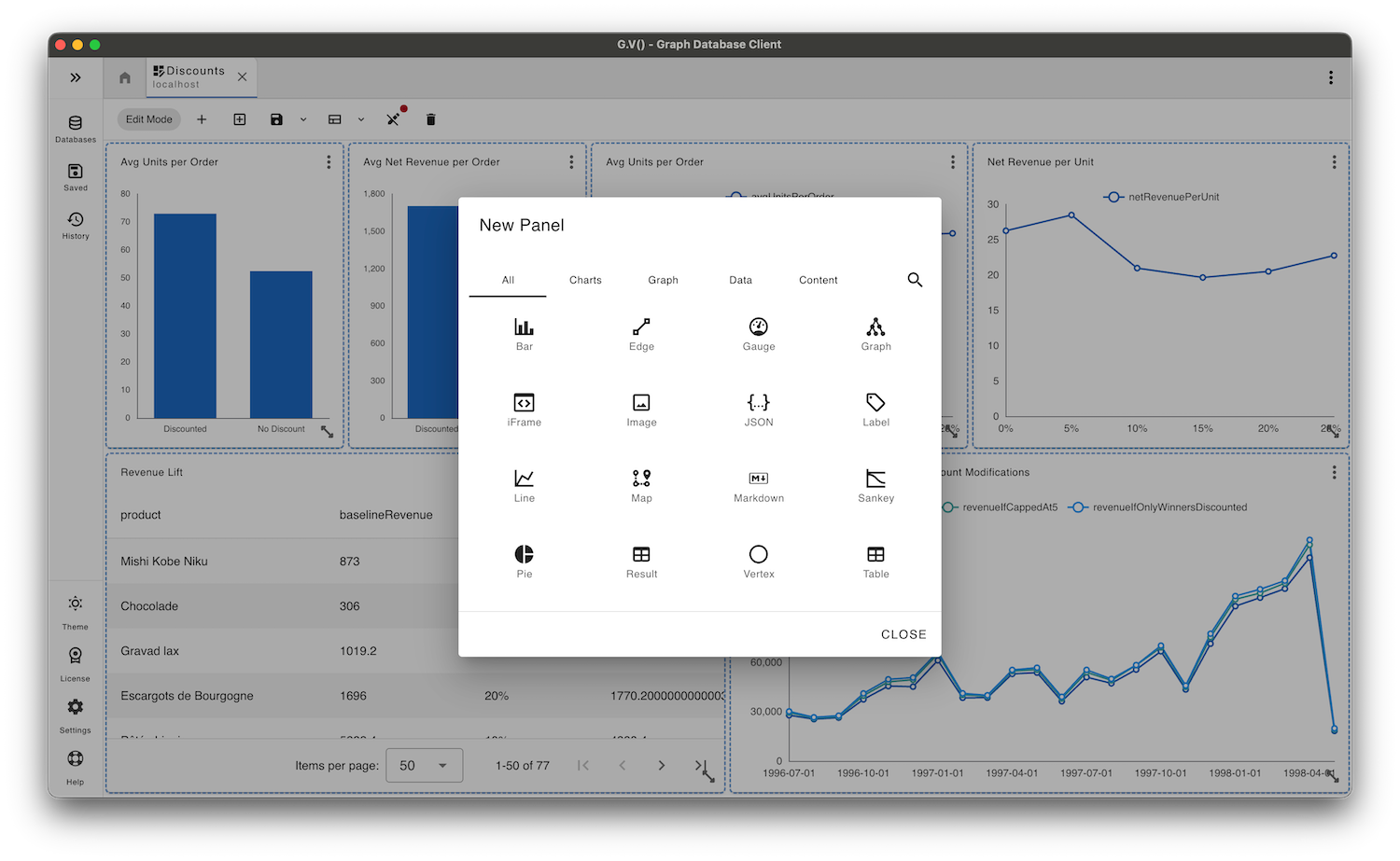
Use gdotv Dashboard Panels
With the introduction of dashboards in gdotv (release notes here), this data analysis also serves as a practical example of how different panel types can be used to answer specific business questions. Here are a few example dashboards in gdotv that include the panel types discussed below.


The panel types below are described in terms of why they were used, not simply what they display.
Bar Charts
Bar charts are the workhorse of dashboards and were used extensively here for good reason. They are best suited for direct comparisons between categories, such as discounted versus non-discounted orders or counts of products that gain or lose revenue under discounting.


Line Charts
In the discount-level analysis, line charts make diminishing returns visible by showing how order quantity rises while revenue efficiency falls as discounts increase. In the modeled revenue section above, line charts allow multiple discount policies to be compared over time, making the long-term impact of different strategies easy to assess at a glance via the dashboard.
Line charts are particularly effective when comparing values that change across an ordered dimension, such as time.


Tables
Tables are best used when raw data matters. Reach for these when you are looking for specifics within a filtered amount of data.
Labels
Labels within a dashboard can be used to surface key conclusions without requiring a chart at all. For example, a label summarizing that “Open Tickets: 12” could be placed alongside the open tickets table for more detailed inspection.


Gauges
Although not used in the final dashboard here, gauges can be effective for tracking single, bounded metrics over time. In this context, a gauge could be used to show the share of total revenue coming from discounted orders.
Gauges work best when there is a clear notion of acceptable versus unacceptable ranges.


Sankey Diagrams
Sankey diagrams are best used to show how data funnels from one state into another. They make it easy to see how volume splits, merges, and moves across a system. This is especially useful for understanding flows like user journeys, transaction paths, or resource allocation.


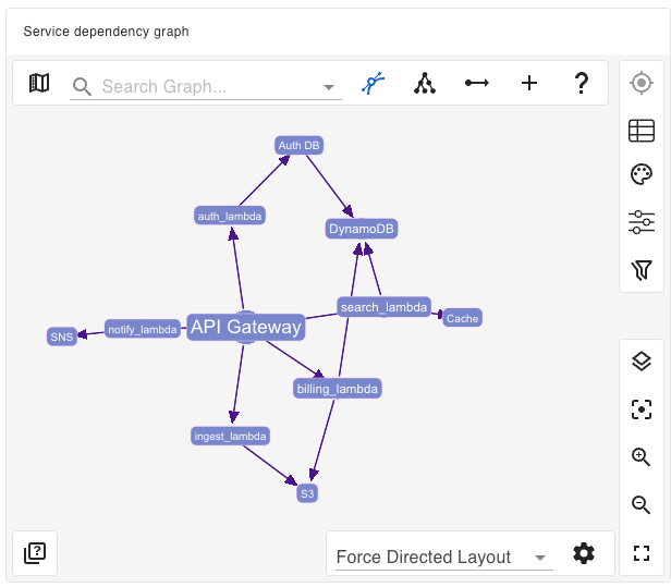
Graph Visualization
Graph views can be used to explore structural relationships in the data itself. In the context of the Northwind dataset, this could include navigating from customers to orders to products, or understanding supplier dependencies when considering pricing changes.
Other Data Visualization Options: JSON, Images & iframes
You’re not just limited to charts: JSON data output, images, and iframe panels are also available in gdotv dashboards. Many other panels can be used to express the story you are trying to tell, whether it is the employee of the month photo, built-in documentation frames, or raw JSON dumps, you can use these panels to support your decision making process.
While gdotv provides a wide range of panel types – and will continue to add more in the future – this example dashboard intentionally uses only a subset of what is available.
Effective dashboards do not maximize visual variety or density; they maximize clarity to better support decisions going forward. Each panel should earn its place by answering a question that no simpler alternative can answer as well.


Closing Thoughts
Dashboards matter because they turn raw data into something you can actually consume. They give you a shared view of what’s happening, which helps teams stay aligned and make critical decisions with the same context.
More importantly, they reduce the friction between having a question and getting an answer – you’re not digging through tables or writing ad hoc queries every time something comes up.
A good dashboard doesn’t just report what happened, should help you understand why it happened and what to do next.
Curious about what else you can build and visualize in a gdotv dashboard? Download gdotv and explore your graph data with an IDE that makes your work more effective at every turn.


