Who Needs a Chart When You Can Just Chat? [feat. Data Day Texas 2026]
![Who Needs a Chart When You Can Just Chat? [feat. Data Day Texas 2026]](https://gdotv.com/wp-content/uploads/2026/04/graph-visualization-christian-miles-video-speaker-notes.png "Who Needs a Chart When You Can Just Chat? [feat. Data Day Texas 2026]")
How humans visualize and understand their data is changing. It’s one of the many things disrupted by AI – but will it go away entirely? Or just be transformed by the tooling we use? And what roles do humans still play in data visualization?
I answered these questions and more in the presentation I did at Data Day Texas back in January. If you missed DDTX 2026, it was the end of an era.
The graph community was well represented, and the gdotv team had a number of reflections and takeaways from the final edition of the conference.
As gdotv’s public-facing Product Champion, I (Christian Miles) had the chance to give a presentation on the future of data visualization in the world of AI. Unfortunately, the talk recording had some errors, so I’ve rerecorded my presentation and included both the video and a lightly edited transcript with slides below.
Whether you’re interested in the future of graph data visualization or just what AI means for data representation, I hope you enjoy the talk and hopefully learn something too. Here it is:
Introduction
I have a two-year-old at home which means I’ve been reading a lot of children’s books. One of our favourites is What Do People Do All Day? by Richard Scarry.
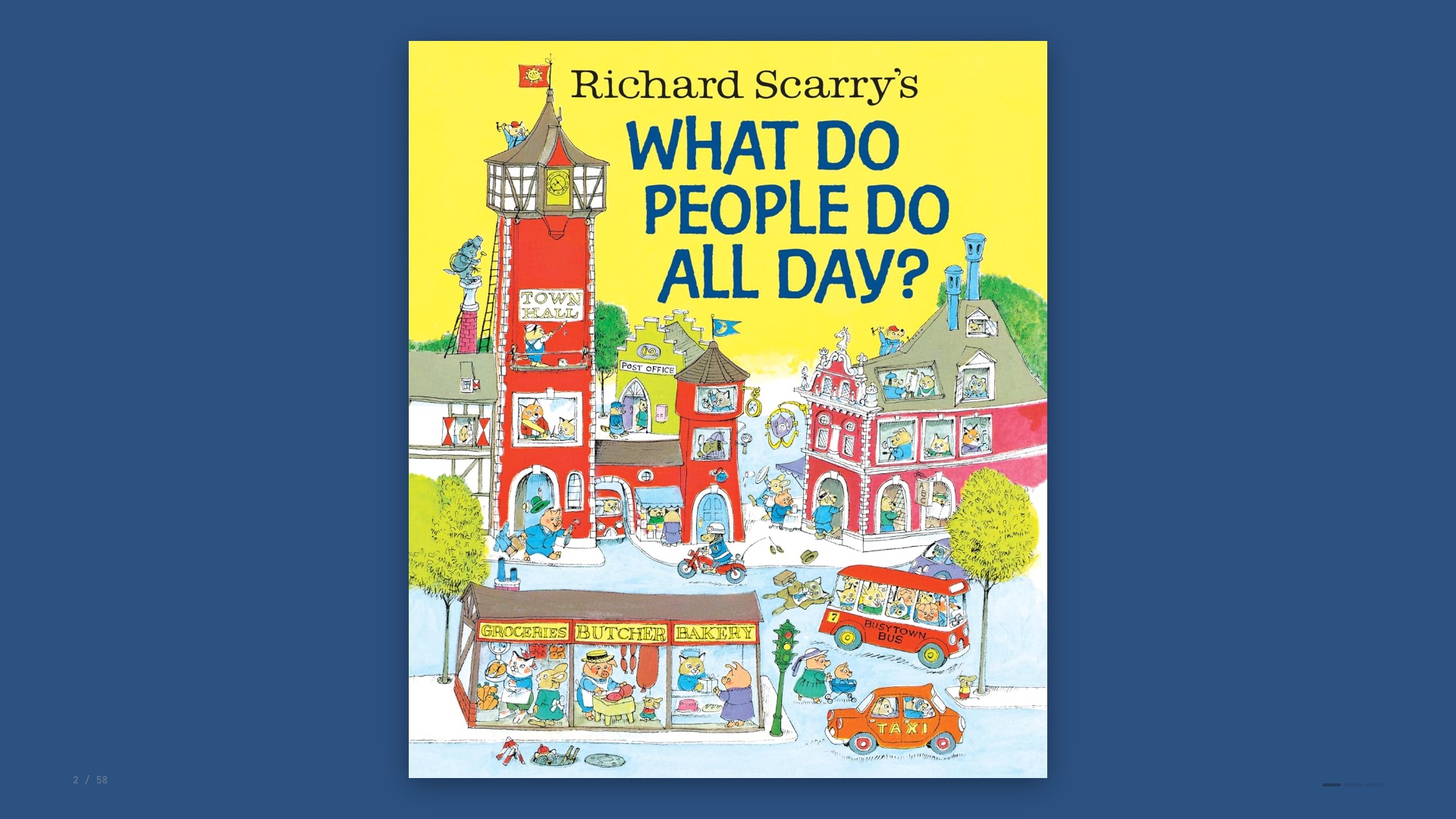
For those who aren’t familiar, it’s a 1970s classic featuring anthropomorphised animals going about their daily lives. Fantastically dense, lots to look at.
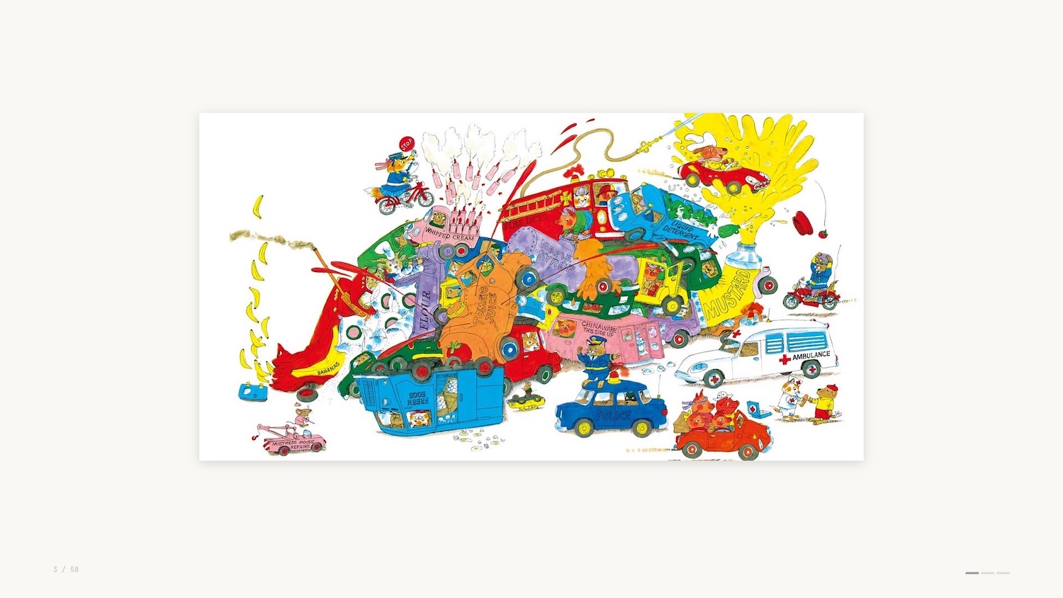
Busytown seems like a pretty cool place to live, although it’s not without its dangers.
But I’ve been wondering why Busytown seems particularly idyllic and aspirational, and I’ve come to the conclusion that it’s because everyone in Busytown has a job.
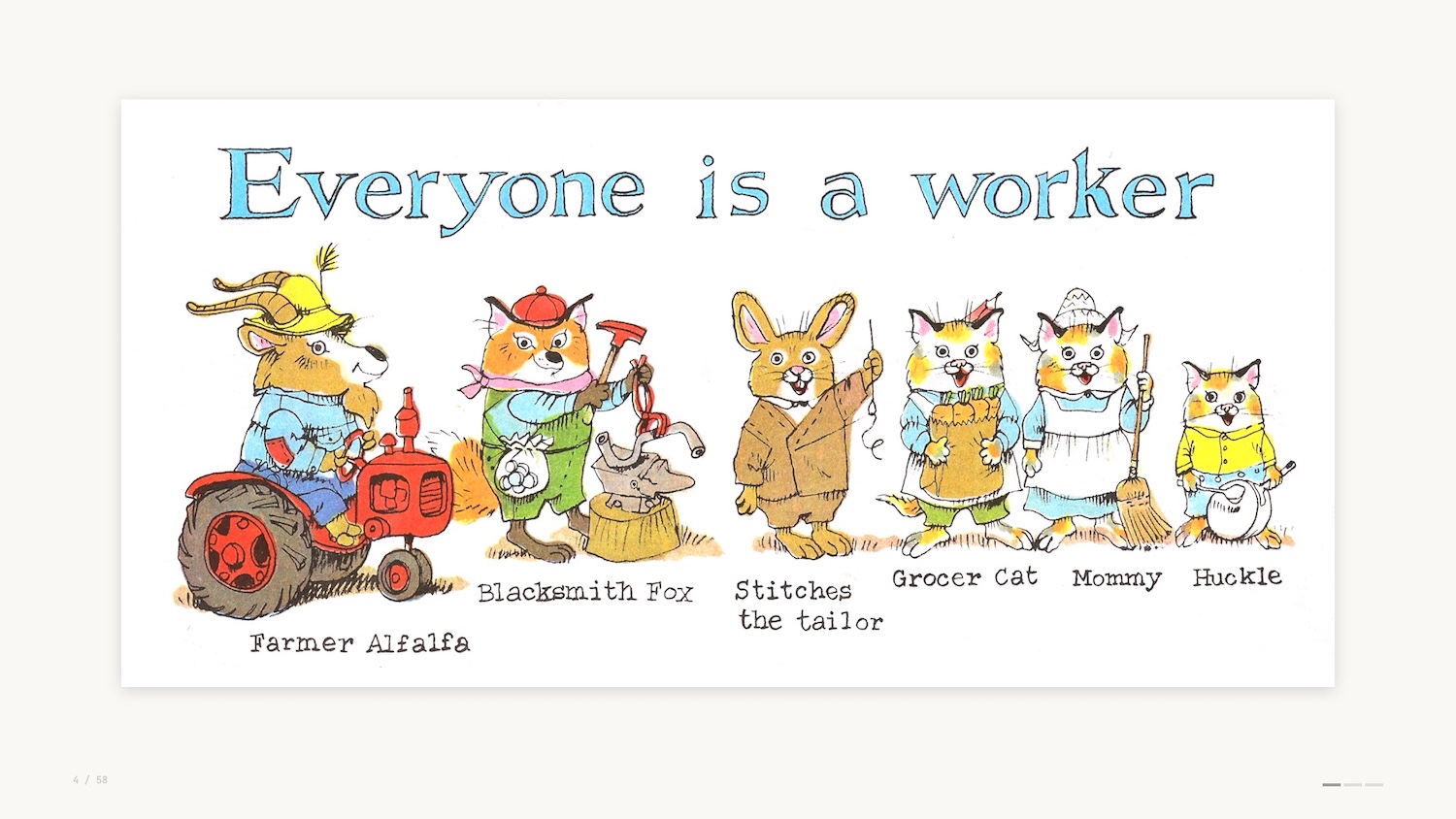
As Richard Scarry says, everyone is a worker. From Farmer Alfalfa to Stitches the Tailor. You can see even young Hucklecat has a job as a helper in the family.
At this point you’re probably wondering why I’m talking about a kids book from the 70s. Don’t worry, this talk isn’t going to be “What Lowly Worm Taught me about B2B Sales”.
But Busytown has made me reflect on the jobs that we do as data professionals, leveraging data visualization to help others make their decisions and ultimately do their jobs.
Data Visualization: What It Does, How It Works & How That’s Changing
For those of you who don’t know me yet, I’m Christian Miles. I flew down from Vancouver Island, Canada for Data Day Texas, and I’m really happy to be here to deliver this talk. Thanks to Lynn Bender for the invite and thanks again to everyone here who chose this talk over the other fantastic speakers at the conference.
I’m here with gdotv, and I’ll touch on some of the work we do later in the presentation.
My area of expertise is graph visualization and network analytics, but today I’m taking a wider look at the role of data visualization – what it does, why it works, and how that’s changing.
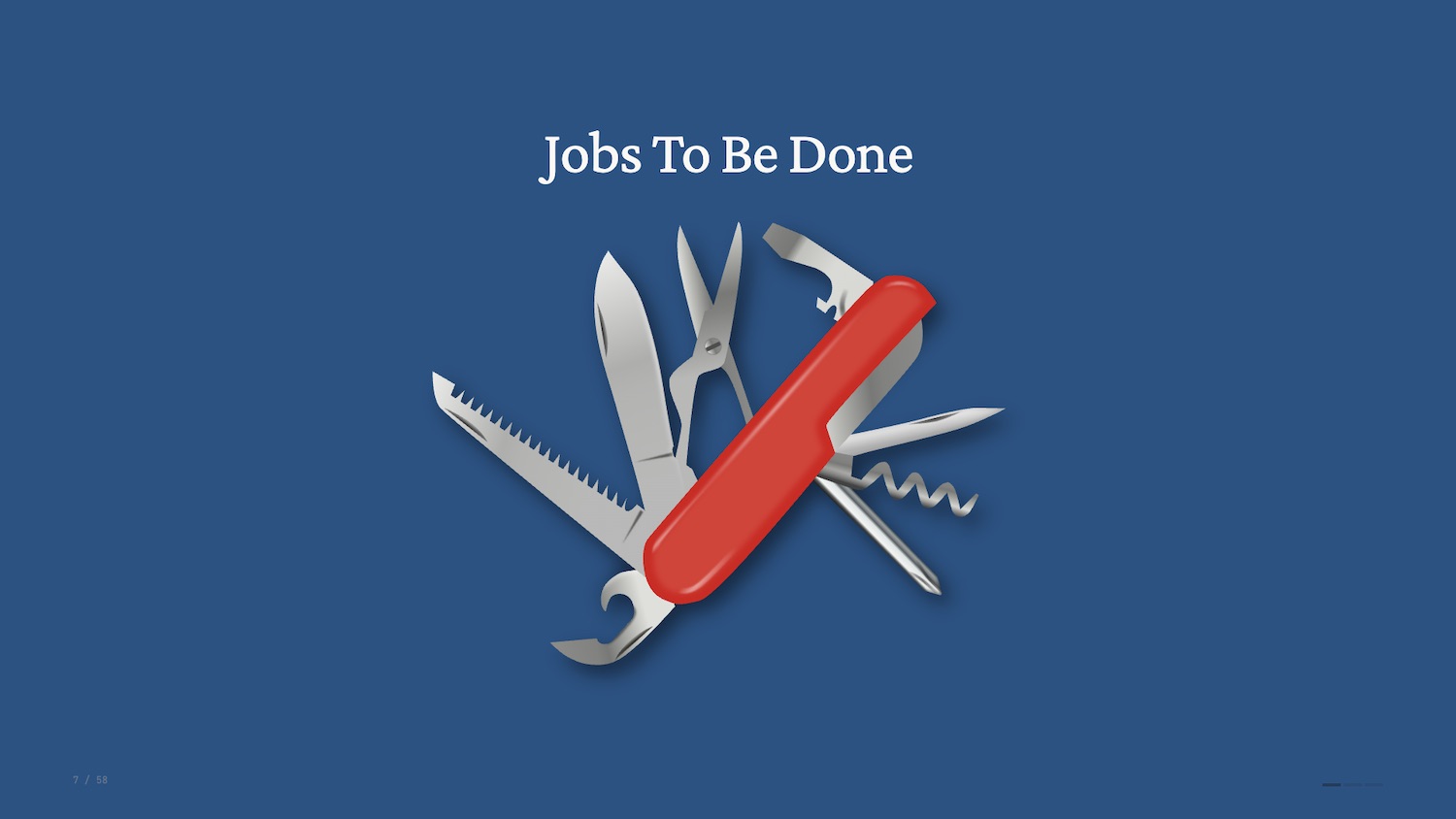
If you’re not familiar with it, Jobs to Be Done (JTBD) is a product marketing framework that was popularised in the early 2000s as a way to explore why products are created and why they are used.
In a nutshell, the JTBD framework helps us consider the tasks that individuals are trying to complete via your product. This might sound obvious but it’s fundamental – we easily lose sight of this when we build products.
You might build something to show off, to try a new technology, or simply because you can. But none of these are helping your end users to do their jobs.
You likely work with a number of what I’ll call “data interfaces” when you do your job. These are some of the most common ones pictured below.
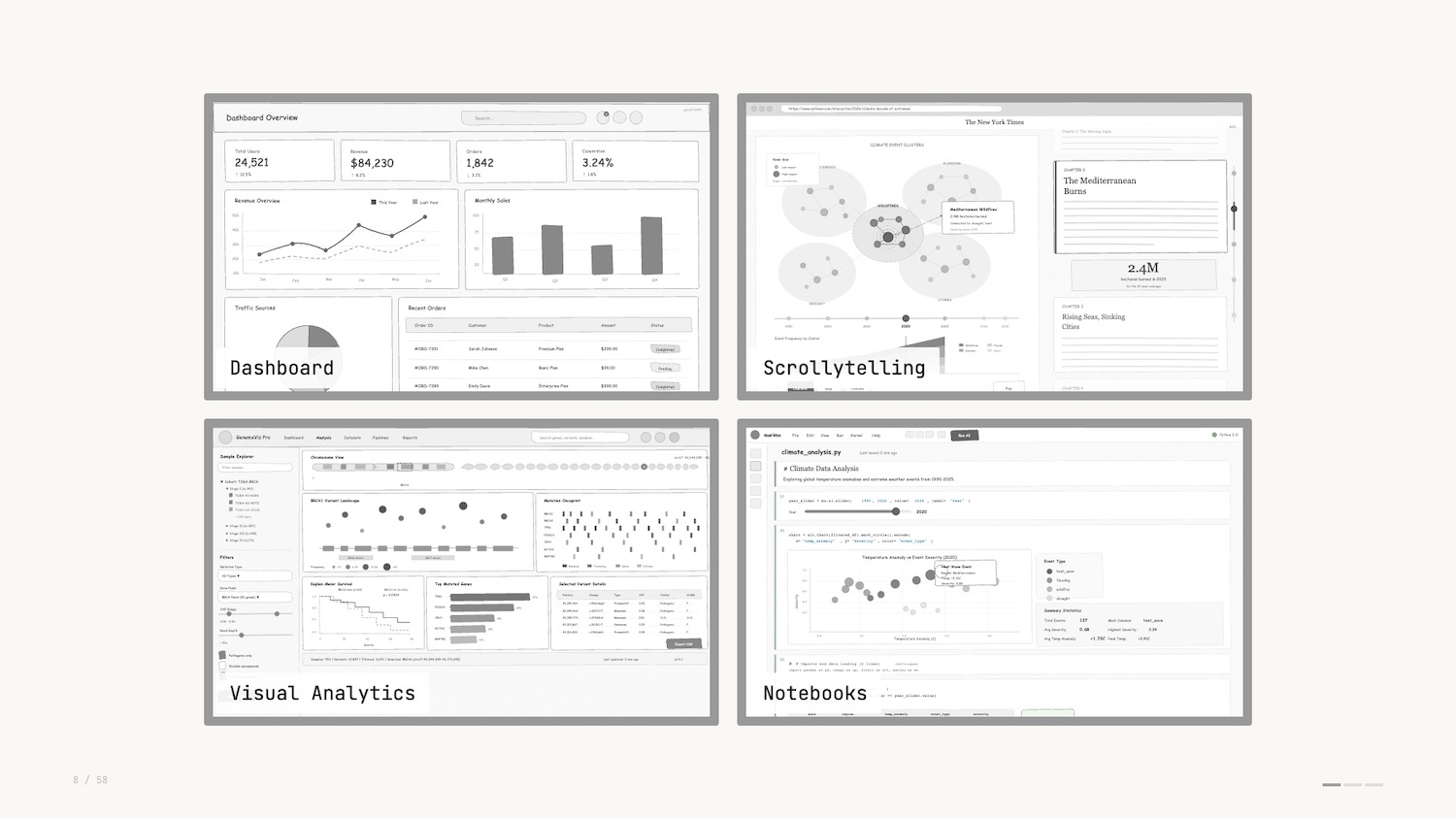
You’ll notice that different visualizations are used as individual “widgets” as part of a wider application.
The job to be done varies between these different interfaces. Dashboards track important metrics over time so you can keep your deployments running. Notebooks help data engineers explore data and verify assumptions before production versions ship. Bottom line: the job of data visualization is to communicate data in a way that enables decisions.
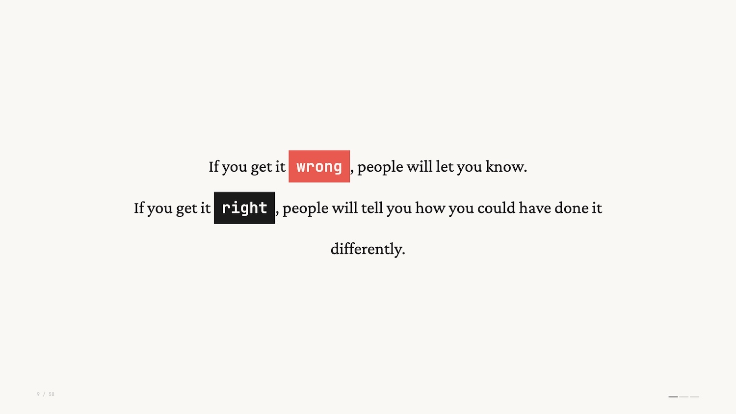
Data visualization is like any visual medium – there are infinite ways to represent data and therefore there are infinite opinions on how it can be represented. It’s funny, if you get it wrong, people will let you know. If you get it right, people will also let you know how you could have done it differently.
Personal opinions and recommended best practices have led to strong opinions strongly held. These rules and strong opinions speak to the significance of the data around us and how we talk about it, including rules like:
- Don’t use pie charts
- Don’t use 3D charts
- Always start axes from 0
And many more, of course.
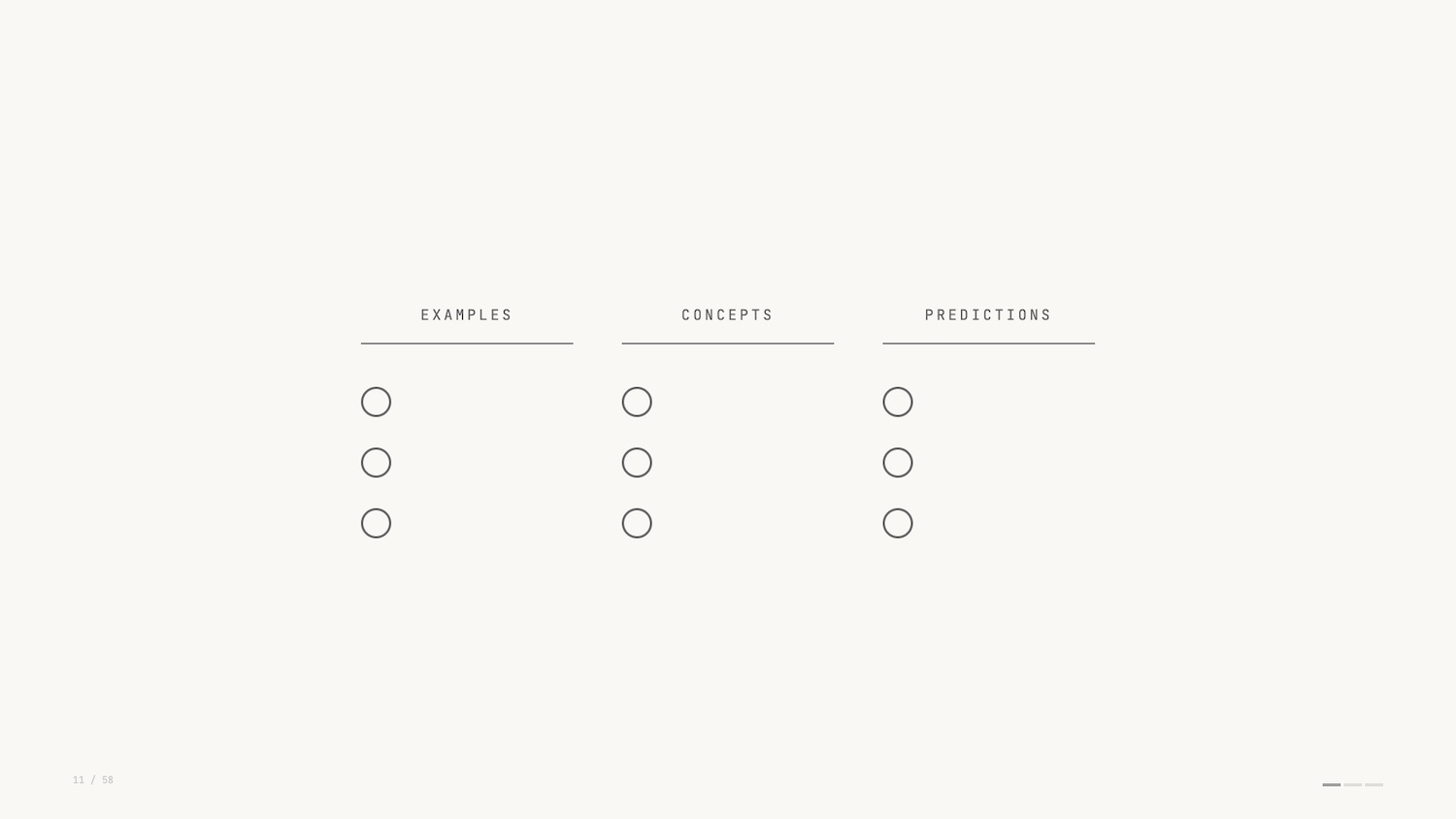
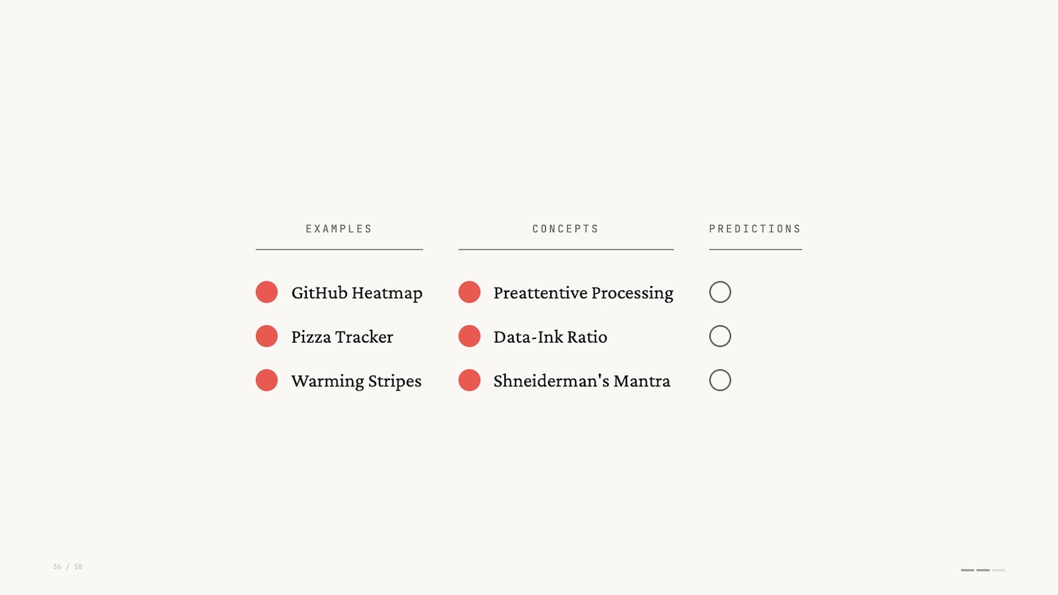
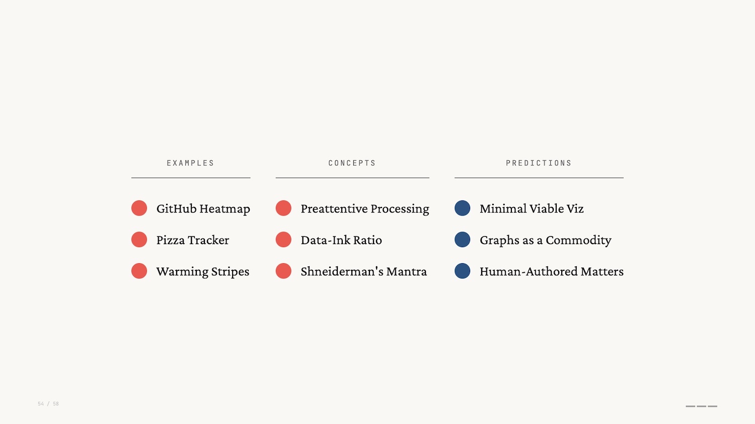
The talk today is a talk of threes. I’ll walk you through three examples of data visualizations that you likely haven’t thought about.
Along the way I’ll introduce three of the most important concepts when thinking about designing and using data interfaces. My goal here is to help you understand why data viz works and hopefully help you sound smart when discussing data interfaces with colleagues.
Finally I’ll provide three predictions for where data visualization and data interfaces are going from here.
Data Visualization Examples
The GitHub contribution graph (shown below) will be familiar to anyone who’s used GitHub. It lives on the profile home page: a heatmap showing, at a glance, the commits made over the past year.
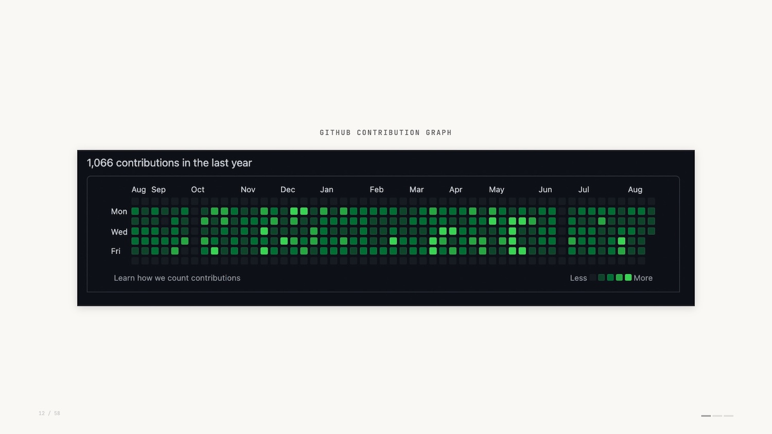
Of course, the GitHub contribution graph can be easily faked. Why would you do that? Perhaps to impress prospective employers. This demonstrates how seriously folks take it.
Another example of a data visualization that you use many times a day without thinking about it is the humble progress bar. The best example I can think of is the Domino’s Pizza Tracker.
![]()
The Pizza Tracker shows you the progress of the pizza you’ve ordered. It was pretty novel in 2007.
When searching for images for this presentation I stumbled on some limited edition themed versions of the pizza tracker. They even had built-in soundtracks. Turns out Domino’s was an early pioneer in data interfaces tailored to distinct personas.
![]()
So the GitHub contribution heatmap and the Pizza Tracker: small but effective examples of data visualization. But how do they work? Let’s look at a little bit of theory.
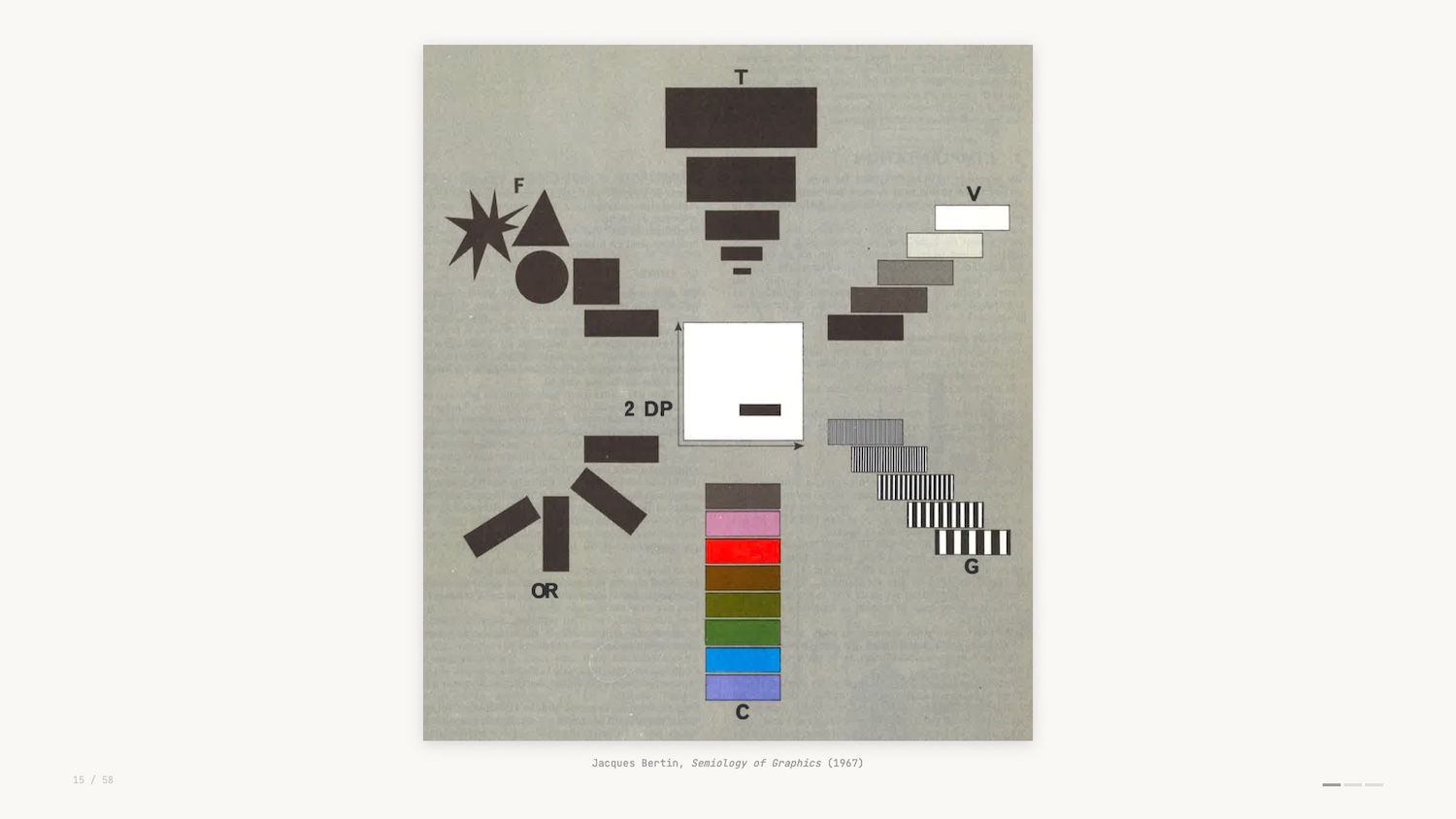
When we build visualizations we’re drawing from a set of visual encoding channels – a sort of vocabulary for data viz. This scan (above) is from an early formulation of this theory and shows the different channels you can use to create various data visualizations.
For example, the GitHub graph uses luminance as its visual encoding, and the Domino’s Pizza Tracker uses length and area as its visual encoding.
Concept: Preattentive Processing
This vocabulary works hand in hand with a concept in perception science called “preattentive processing.”
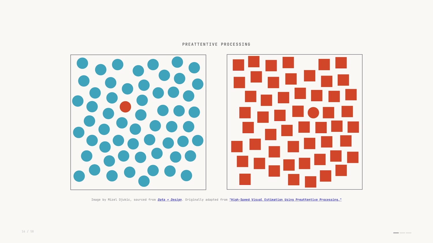
Preattentive processing is a sort of simultaneous processing. The easiest way to describe it is that you see before you think.
Rather than comprehending the details of the image, you in fact view it in totality and make judgements before your brain has had a chance to fully take it in. To me, this is the reason data visualization is such a powerful tool: we’re able to leverage such a base instinct to understand what we see before us.
And it’s important to explore what happens when we don’t visualize and rely on other methods of analysis.
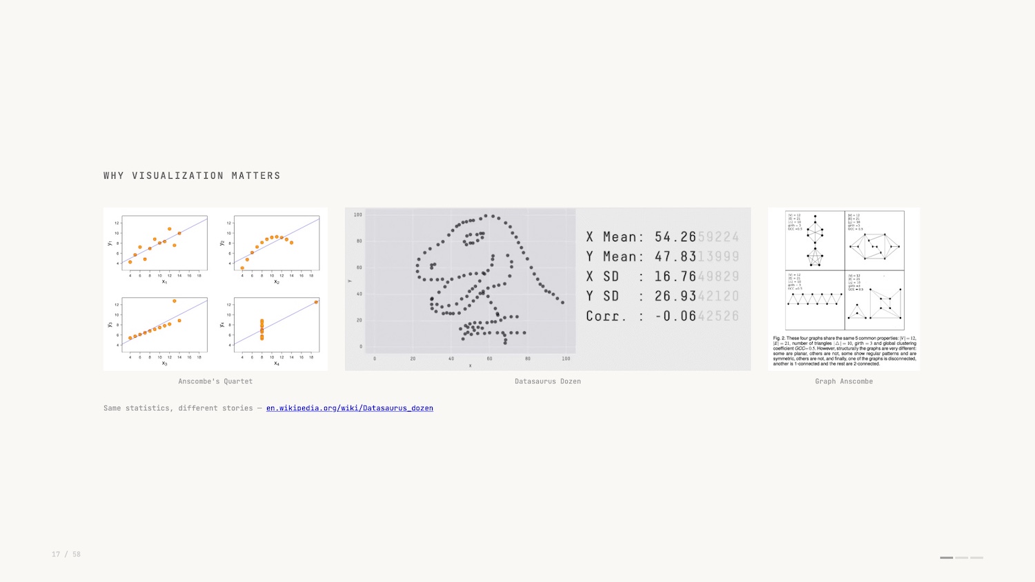
Anscombe’s quartet pictured above right is a famous example of a dataset that only reveals its true structure when you visualise it. I like the more modern take by researchers at Autodesk in 2017: the Datasaurus Dozen (in the middle above).
In both examples, the summary statistics of the dataset don’t change despite the dramatically different plots? You would have no idea if you didn’t plot and visualize the data.
So that’s our first concept, preattentive processing. Let’s look at an inspiring and impactful example.
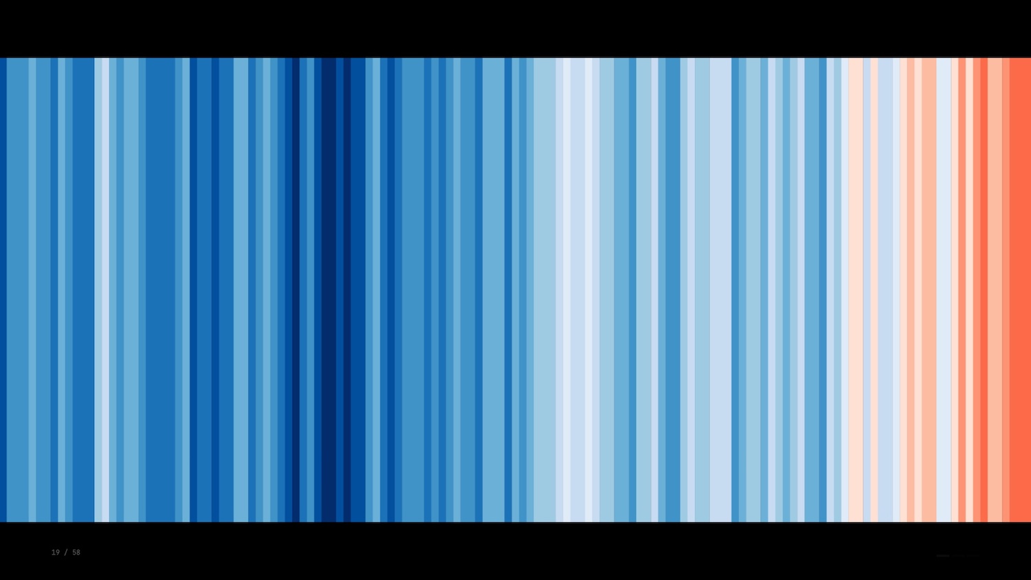
The warming stripes were created by climatologist Ed Hawkins in 2018. Here we see a single bar representing each year with the colour representing the average temperature globally.
There’s no labels, no legend, no numbers: just a raw depiction that catches your eye and makes an impact before you have a chance to fully grasp it. The funny thing about this visualization is that according to some visualization thought leaders it’s all wrong.
Concept: Data-Ink Ratio
Edward Tufte is a famous figure in data visualization known for his immaculately typeset, self-published tomes on information design and related topics. To give you a flavour of the guy, the story goes that he wasn’t happy with how any publisher was typesetting his books so he did it himself.
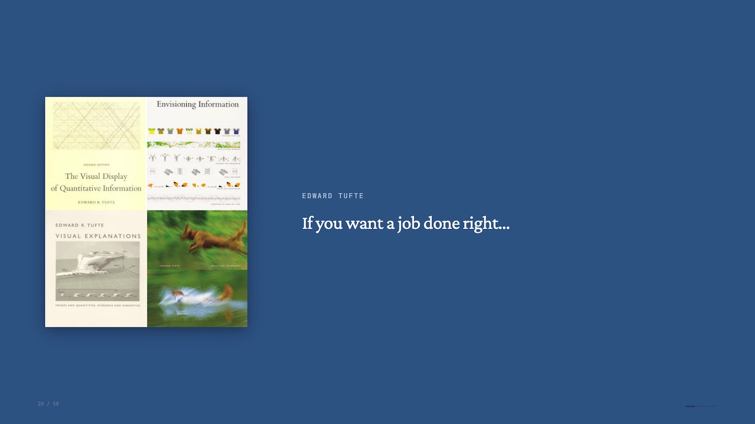
Perhaps his most enduring coinage is the data-ink ratio.

In short, the data-ink ratio states that every part of a depiction of data should have a purpose. You should be looking to maximize the value of the “ink” (or pixels) vs. the data it represents.
Tufte went further though: Anything that gets in the way of this ratio is labeled “chartjunk” – a bit of a slur now. Thirty years later and many data viz practitioners get a bit grumpy at the mention of Tufte’s name. His advice and positioning was influential but it’s all too often treated as a dogma.
One of my favourite rebuttals of the data-ink ratio is Frank Elavsky’s take which takes the ratio to its extreme conclusion. He starts with a standard bar chart and progressively strips away elements in pursuit of a higher data-ink ratio.
Frank Elavsky's rebuttal of Edward Tufte's Data-Ink Ratio


The gridlines go. The axis labels go. Eventually, even the bars themselves are reduced until you’re left with nothing at all. Infinite data-ink ratio, zero information. It’s a funny and effective critique.
But, saying that, the warming stripes is a fascinating example of extreme data ink ratio and conveys so much with a single data encoding. One of those examples where rules are meant to be broken – or at least adapted.
That’s the second concept: data-ink ratio.
Exploratory vs. Explanatory Data Visualization
For the final concept, I’ll first turn to another influential book.
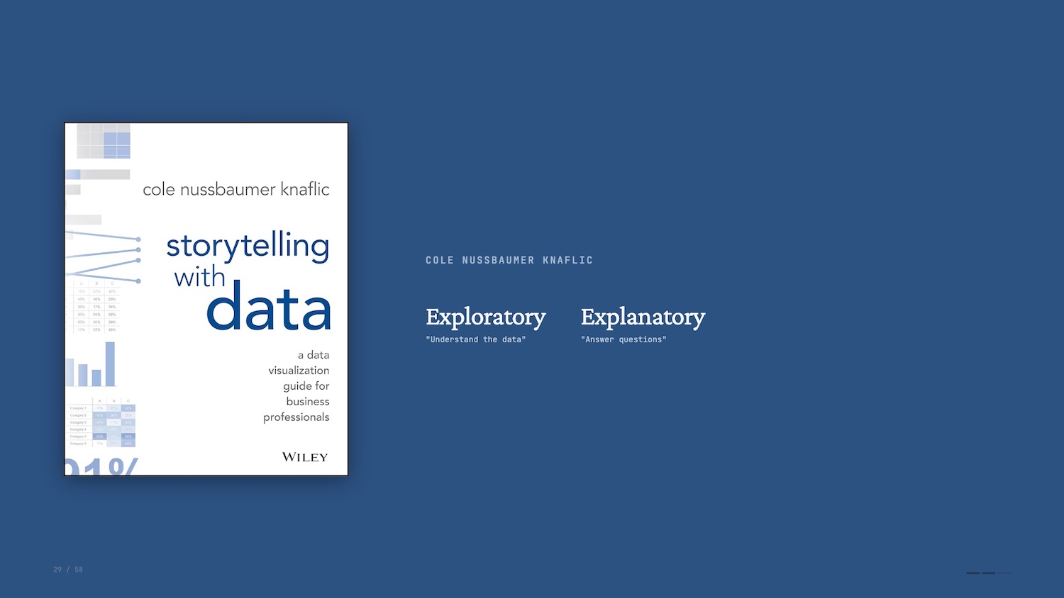 In Storytelling with Data, Cole Nussbaumer Knaflic makes a distinction between exploratory and explanatory data visualization.
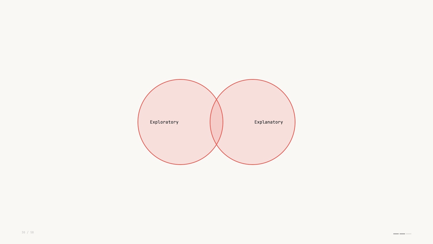
Understanding and exploring the data is an analyst’s job. Explaining the data pivots to being audience facing: communicating a narrative to others. It’s the difference between running a query and producing a report.
I mentioned earlier that I focus on a form of data visualization where we work with networks or graphs. Part of the reason I find this so interesting is that I think it exists in the intersection of the two types of data viz.
As humans we are drawn to mapping out complexity. We yearn to understand how things are connected and graph visualization is uniquely suited to that instinct.
Networks are everywhere: social networks, flight paths, the electric grid, database schemas. And with modern web technologies, we can invite folks to interact with and explore dense networks, making explanation and exploration the same act.
Concept: Shneiderman’s Mantra
Shneiderman’s Mantra – overview first, zoom and filter, details on demand – is the guiding star for every data interface I build.
- Overview: See the whole structure before drilling in. A minimap or summary bar orients the viewer.
- Zoom and filter: Mouse wheel, pinch, legend-based filtering. Interactivity is the point, not a feature.
- Details on demand: Strip clutter behind hover or tap. The information exists, but it only surfaces when needed.

Let’s go to a real-life example of this. I work for gdotv, and we provide a graph database IDE to help developers query and visualize data in their production graph databases.
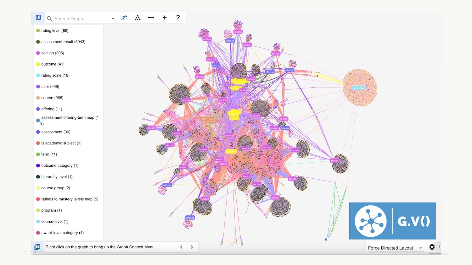
For an overview, you can query the whole graph and visualize it, but overview could also be summary bars, or minimaps.
Another form of overview could be a schema: here below we have an interactive graphical representation of the data model in the database.
![]()
Like pretty much all graph visualizations you can zoom in to explore, and filter using the legend on the left hand side, a common pattern.
The third and final part of Shneiderman’s mantra is details on demand. Harkening back to Tufte we want to minimise clutter and potential chartjunk and choose not to include all attributes in the graph visualization. You can therefore select a node and see the context when needed.
Shneiderman’s mantra is the final data viz concept I wanted to introduce you to today. Now let’s talk about where things are heading.
The Future of Data Visualization
Okay, we’re halfway through and I haven’t mentioned two little letters even once: AI.
AI cuts through everything: creation, consumption, volume, medium, and tooling. It, of course, impacts data visualization, and I want to explore this for the remainder of the talk.
The use of AI is of course a hot topic. I want to strip back some of the hype and reassess the transformational nature of the technology.
One way to reflect is to look back at this XKCD comic from 2014. Some things in computer science are hard, some are easy – but it’s not always clear which are which.
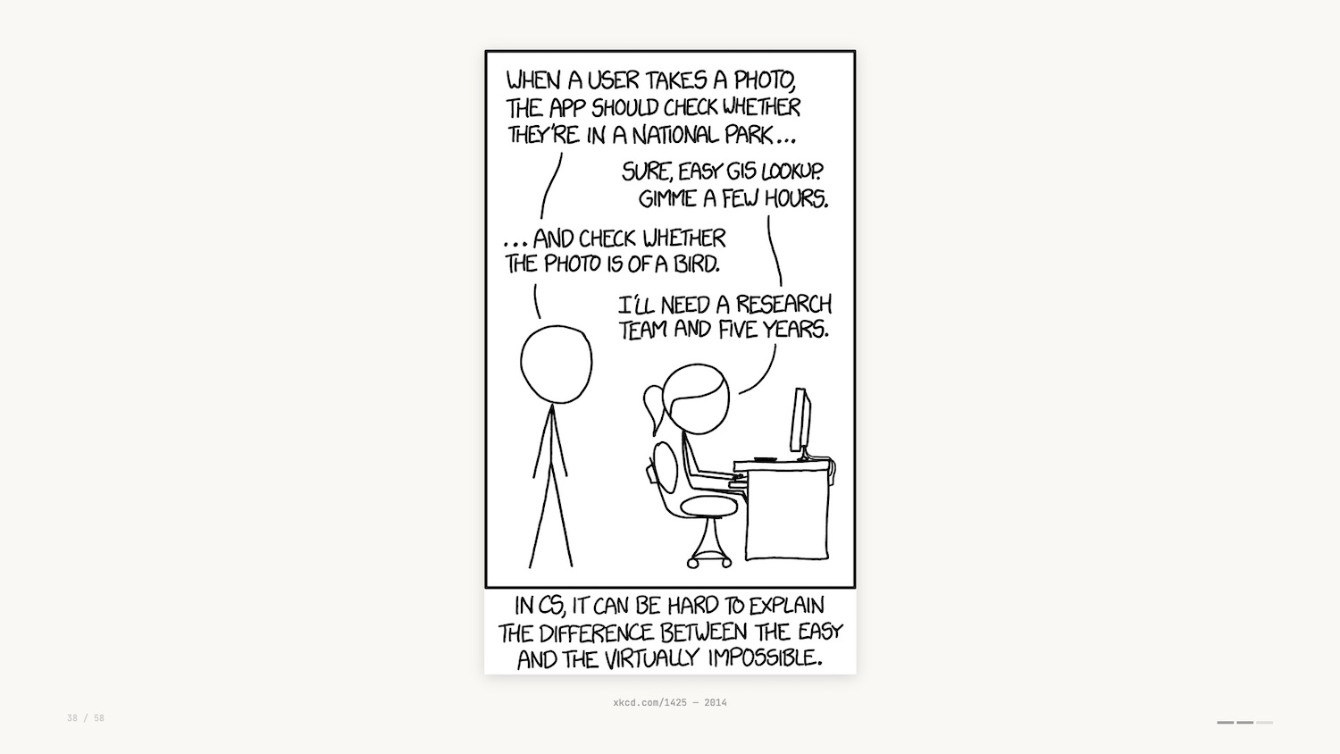
11 years later and the example given here is no longer correct. With vision models it’s now trivial to determine whether a photo is of a bird.
In the world of data visualization, due to a strong understanding of visual encodings and core technologies, LLMs do a fantastic job creating charts and graphs from datasets and natural language descriptions.
And what about the data interfaces we’ve touched upon so far? AI collapses the distinction between exploration and explanation.
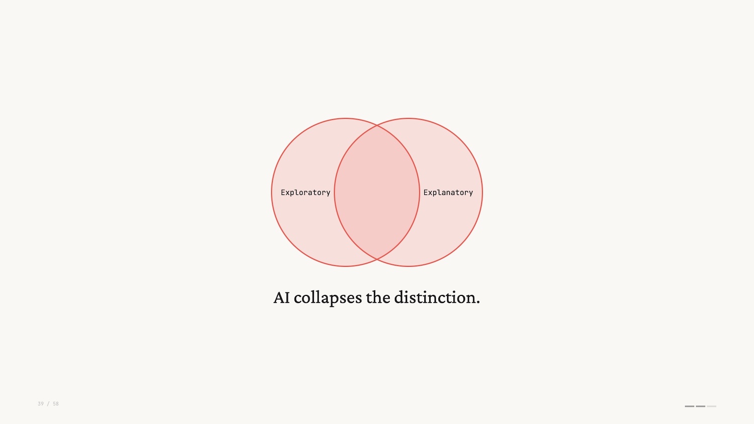
With AI, you get an answer to the question it guessed you were asking before you realized it, which has a risk of being the wrong question. Data exploration used to require friction and skill. LLMs remove the friction and give the impression of skill.
Harkening back to the beginning of this talk, the first pass I saw for many data interfaces was the addition of a sort of “chat bot” on the right hand side (pictured below).
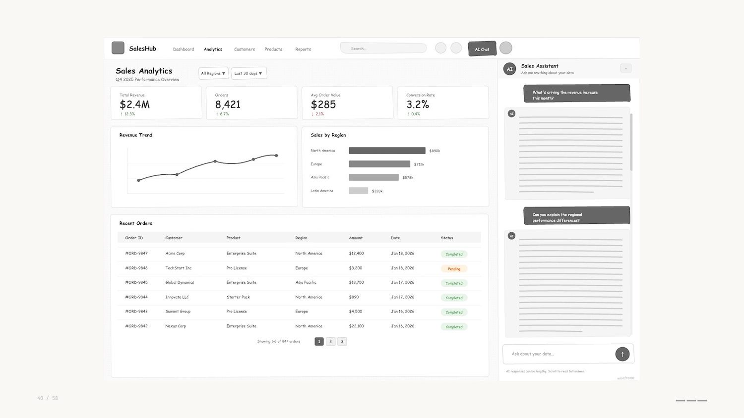
These are often the same sort of chatbot you see on websites when buying plane tickets or tracking a parcel. I’ll describe these pejoratively as “chatbots” although I know that definition has a wider use than the one I’m describing here. To me, they represent the frustrating experience, pre-LLM, of trying to do a job “on rails.”
The chatbots are invariably verbose, usually hitting you with a wall of text, often explaining that they can’t help you.
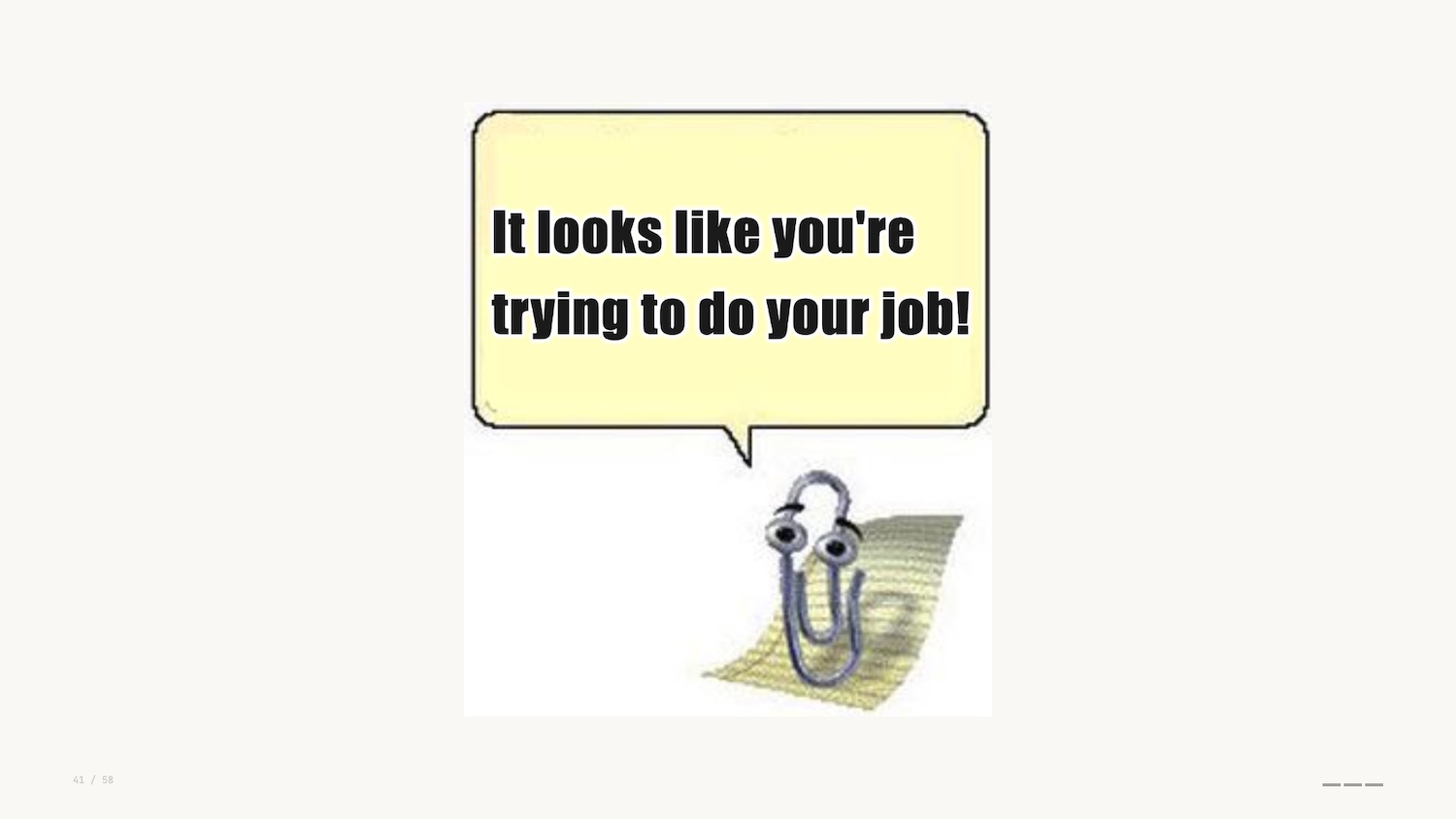
I don’t know about you, but this new wave of chatbots gives me severe Clippy energy.
It’s clear to me that these side bars are a dead end when it comes to the development of data interfaces. A combination of the proliferation of these tools and their capabilities is leading practitioners to create fresh interfaces to help users do their jobs.
I liken this approach to those paths you see where people have worn through grass instead of following a paved sidewalk. These are known as desire paths.
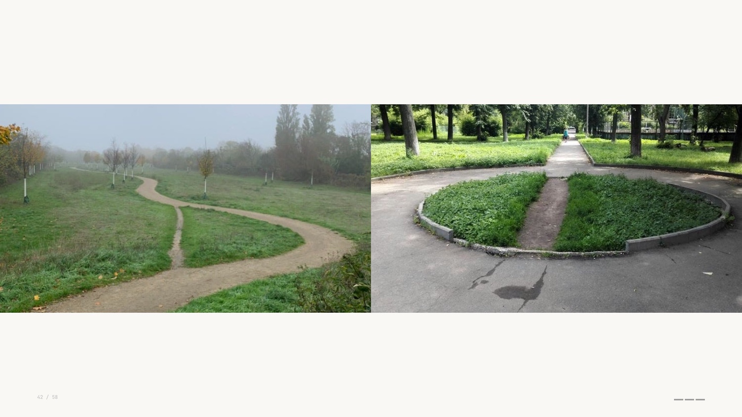
Instead of being constrained by the interface that we’ve built and added to over time, AI tooling helps us prototype and experiment with fresh applications, micro-tools or artifacts that help us get to decisions faster.
This brings me to my first prediction.
Prediction: Minimum Viable Data Visualization
I’m coining a new term for this approach when building viz: the idea of a minimal viable visualization.
This is just enough of an interface to get the job done. “Just enough” doesn’t mean underwhelming – these are often fully-featured apps. The sort of thing that would have taken days or weeks before.
They have interactivity at their core: toggles and sliders to explore, hypothesize, assess. They’re micro-tools for a single job, then you throw them away.
Data viz educator Enrico Bertini uses the word “supple” to describe the use of AI to make these tools. The ability to create artifacts through natural language still feels like magic.
I mentioned earlier that Busytown is an example of anthropomorphisation. It’s not “what do animals do all day” – it’s people.
For kids books this assumption is common and generally accepted. But for LLMs, we’re told not to anthropomorphise them, the argument being that they are not people and they don’t think.
Language models are constrained by language. Their ability to reason and code is an emergent behaviour. We’re told they’re probabilistic engines simply predicting the next token. “Emergent” means that we don’t truly understand how they work, and data visualization researchers are turning to visual methods to drive interpretability.
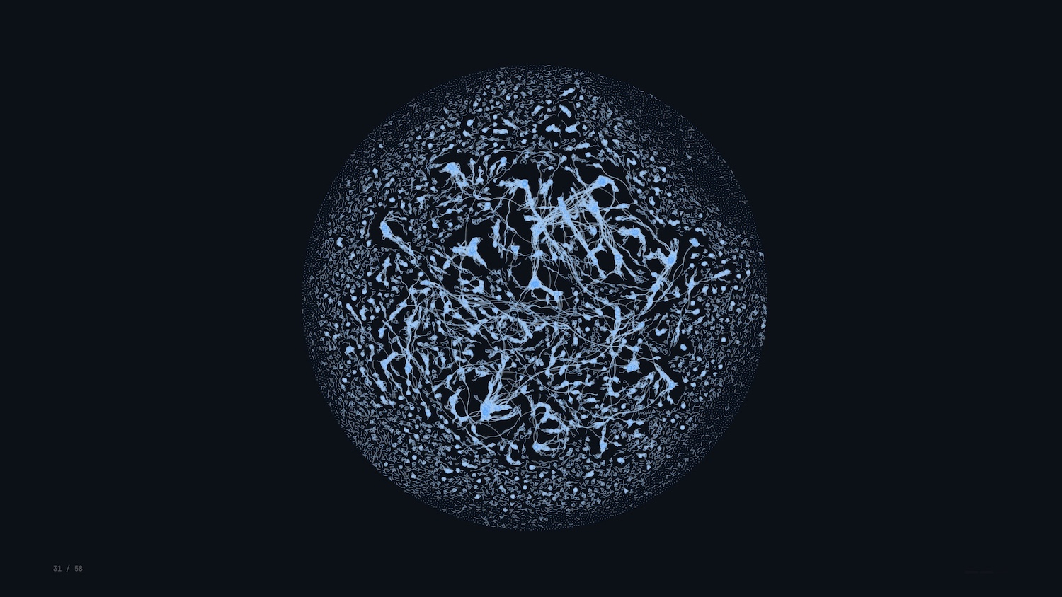
Apple open sourced their Embedding Atlas last year – a visual way of exploring high-dimensional vectors that encode semantic relationships.
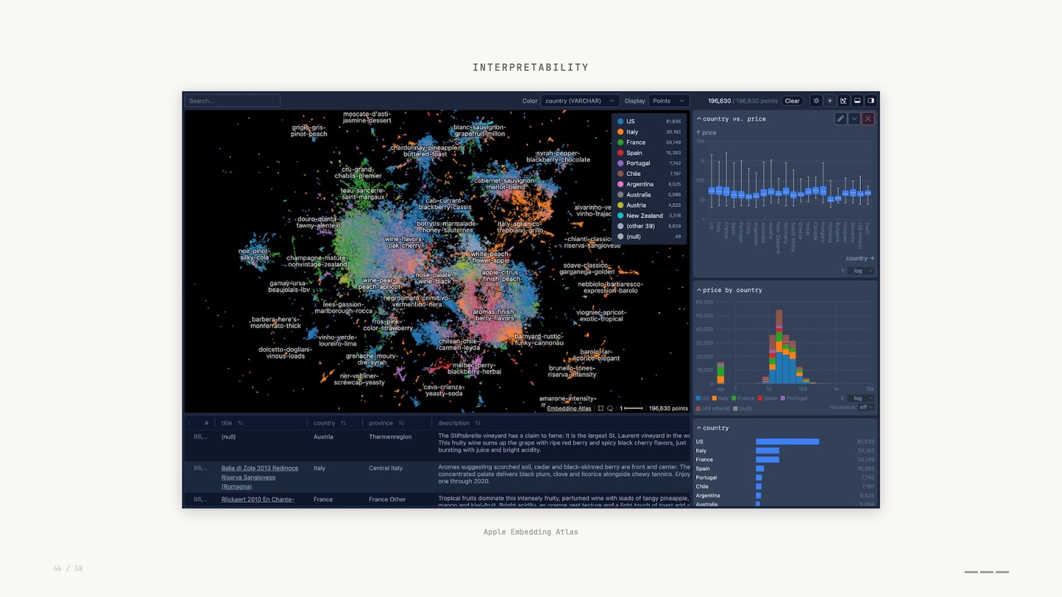
In this graph visualization, we can see how concepts cluster, spot outliers and understand what the model treats as similar. This is where mechanistic interpretability comes in.
In a similar vein, Anthropic, creators of Claude, shared a tool called Neuronpedia to explore the parallels between graph neural networks and neuroscience.
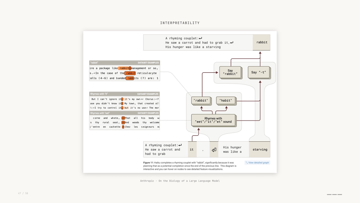
As part of the research, and by leveraging these Minimal Viable Visualizations, researchers asked Claude to generate a poem, and then they observed the internal features that were activated while that poem was being generated.
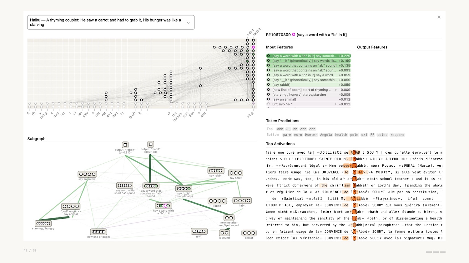
They actually discovered that instead of simple token prediction, Claude planned ahead to ensure that the poem rhymed. The network visualization shown above allowed them to discover this.
So why can’t we just provide these charts to the vision models and LLMs and get them to do this work?
Recent papers show that these models don’t perceive visually the same way humans do.
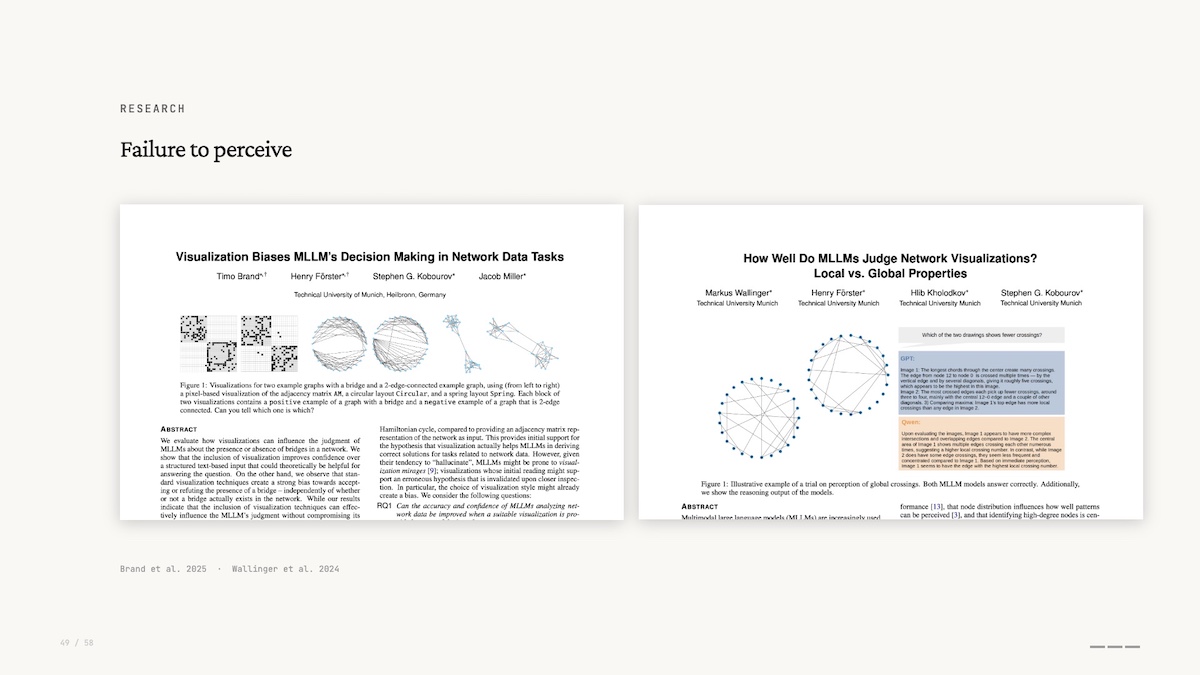
If you remember preattentive processing – seeing before you think – these models don’t do any of that. They perceive global properties better than local ones: they’ll tell you a graph is densely connected but miss that two specific nodes are linked. This is the opposite of what you’d expect if they were actually “seeing” the graph.
This interpretability research, combined with the lack of friction to create Minimal Viable Visualizations, leads me to my second prediction.
Prediction: Graph Visualization as a Commodity
Network graphs and the data interfaces that help us explore and explain them will become standard, not a specialist tool.
We see them as important for interpretability, and we recognise their inherent power for working with the new paradigm of collapsed exploration and explanation.
Another data visualization that is exceedingly easy to create with AI is the infographic. I fed all my notes and slides for this talk into Nano Banana Pro, and it created this infographic visualization.
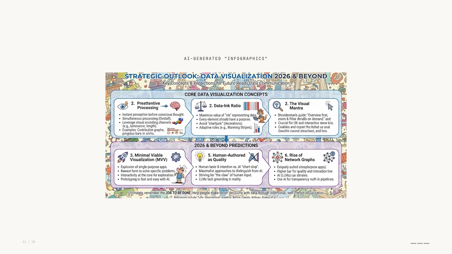
At first glance it looks good. If you’d have told me that this was possible 10 years ago I wouldn’t have believed you. But on closer inspection it falls down: muddled, poor text rendering, no taste. Even if the capability gets better in the future, it misses the point of communicating the intent and experience behind this presentation.
Do the LLMs of today have the same restraint as Ed Hawkins with his warming stripes? If we think back to Tufte’s painstaking manual typesetting, this depiction of information is the polar opposite.
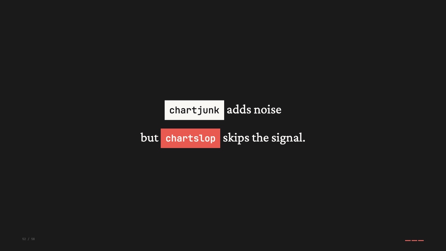
If chartjunk is the stuff on a visualization that gets in the way of the message, are automatically generated images just a new form of junk: chartslop?
Prediction: Human-Authored Data Visualization Matters
My final prediction is that human-authored, or at least human-vetted, will become a marker of quality or distinction.
One could argue that human input doesn’t directly correlate to quality, but the human touch provides an intentionality that is so lacking when individuals blindly defer chart-building to AI.
There will be an emergence of maximalist approaches to data visualization, an artifact of the drive to build something novel and innovative to separate ourselves from the chartslop.
Gabrielle Merite and the team at Figures and Figures created these visualizations for a piece in Vox explaining the transition to clean energy.
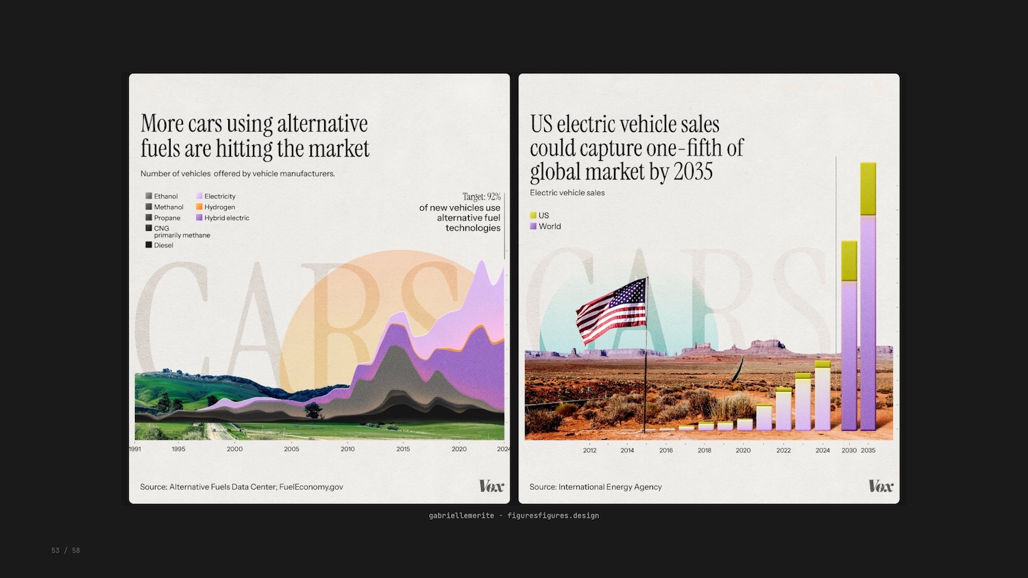
The team’s encodings were intentional: avoiding apocalyptic colour palettes of smoke stacks and melting ice caps, using real American landscapes, purposeful typography with a hidden irony. The response to these new visualizations was strong from all quarters.
Conclusion
So there we have it. Three examples, three concepts, and three predictions for where we go next.
The three concepts I shared today – preattentive processing, data-ink ratio, overview first – remain valuable in the face of AI.
And that brings us all the way back to Busytown. I started this talk reflecting on the people of Busytown and the jobs they do.

AI is absorbing tasks, collapsing friction, generating charts faster than we ever could. But the job was never to make charts. The job was to communicate important concepts to others, to make something AI cannot make alone. That’s your job.
I’d love to hear your thoughts on any of this, so get in touch or find me on LinkedIn.
If you’d like to create your own powerful graph visualizations – and other data visualizations – I urge you to try out gdotv. It’s quick to install and easy to use. You’ll be querying your data in less than 5 minutes.
References
Here are the references and further reading from this talk:
- Richard Scarry, What Do People Do All Day?
- Jobs to be Done Framework
- Jacques Bertin, Semiology of Graphics
- Datasaurus Dozen
- Ed Hawkins, Warming Stripes
- Edward Tufte, Data-Ink Ratio
- Frank Elavsky, Data-Ink Ratio Critique
- Cole Nussbaumer Knaflic, Storytelling with Data
- Ben Shneiderman’s Visual Information-Seeking Mantra
- XKCD 1425, Tasks
- Enrico Bertini
- Apple Embedding Atlas
- Anthropic, “On the Biology of a Large Language Model”
- Brand et al., “Visualization Biases MLLM’s Decision Making in Network Data Tasks”
- Wallinger et al., “How Well Do MLLMs Judge Network Visualizations?”
- Figures and Figures for Vox, “Clean Energy Transition”


